
Blue Sunday,
2026
INDUSTRY
Herbal Medicine
Website Design, Development
SOLUTIONS
A refined, minimalist website designed to bring clarity to Blue Sunday’s growing ecosystem. Built with an intuitive structure and clean visual language, the experience guides members seamlessly through community offerings - making exploration feel effortless, grounded, and easy to return to.
SUMMARY
Blue Sunday is rooted in the belief that healing is not meant to be isolated, but shared. It exists as a communal space for small batch herbal formulations, handmade goods, and local art. Guided by a respect for nature and the body, each preparation reflects a commitment to quality, transparency, and care. Blue Sunday brings people together through a shared curiosity for natural medicine, creating a space where knowledge, ritual, and well-being can be explored collectively.
ETHOS
01
Homepage
02
Product Page
03
Member Home
04
Sitemap
01
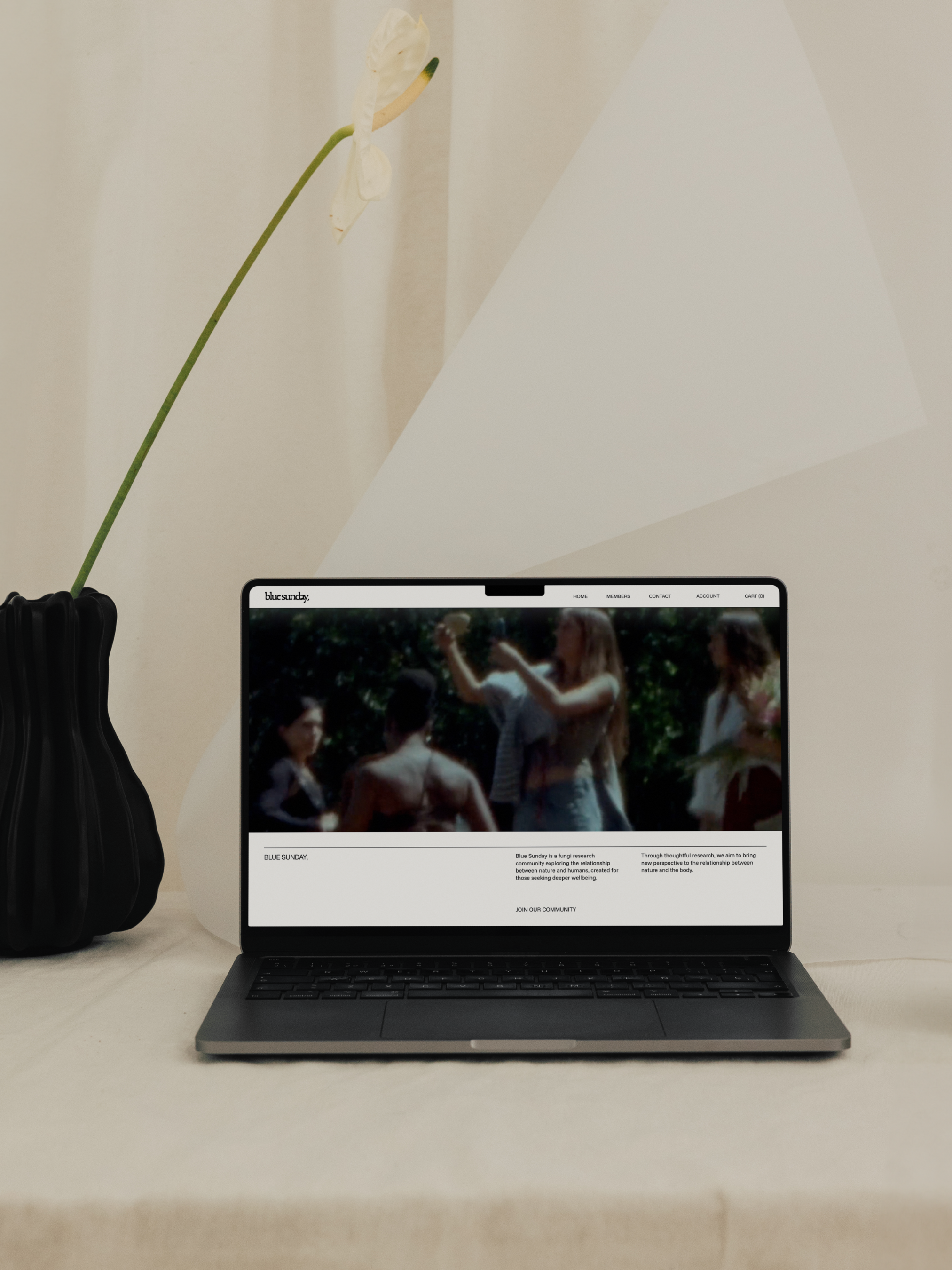
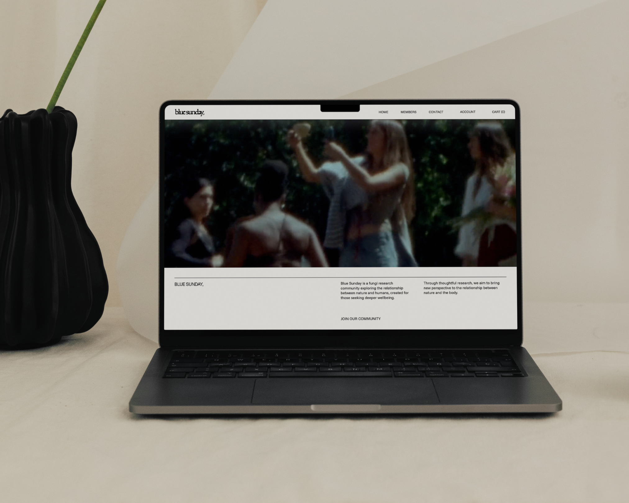
Homepage
Homepage
A restrained, image-led layout designed to feel calm and intuitive. The interface prioritizes visual immersion with a soft, cinematic hero and minimal navigation, allowing content to unfold naturally without friction. Clean typography and generous spacing create clarity, guiding users through the experience with ease while maintaining a refined, grounded presence.
02
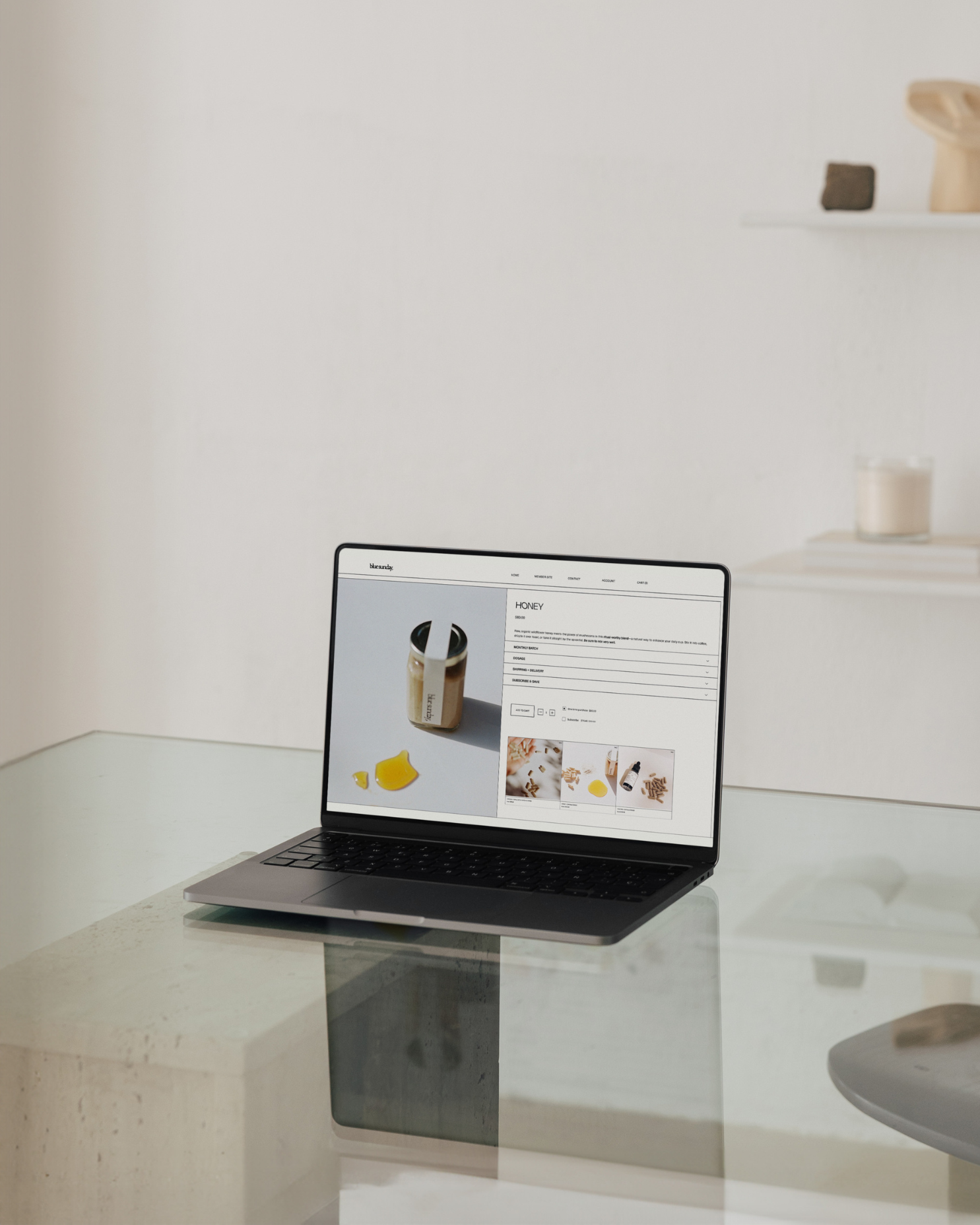
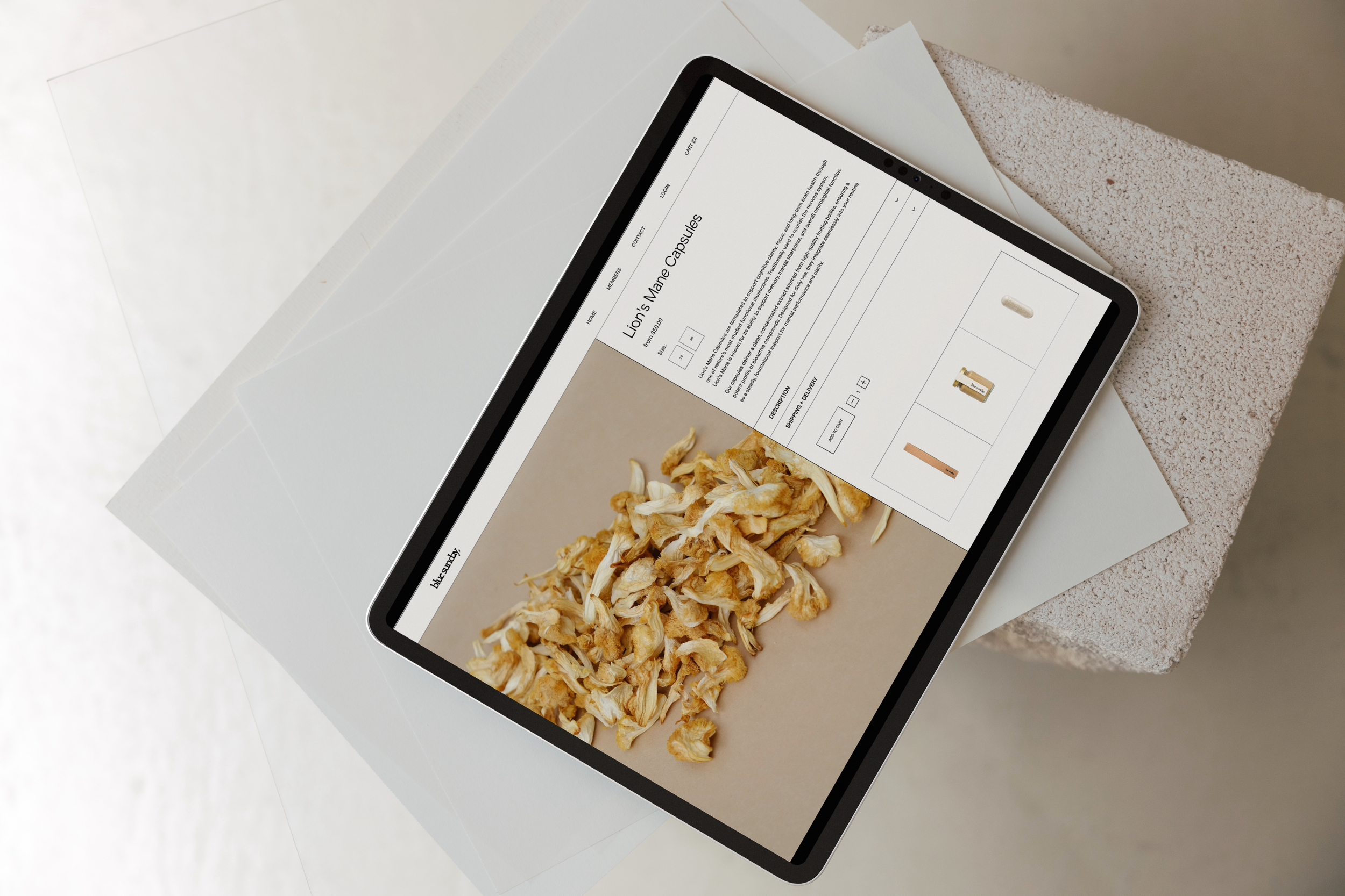
Product Page
Product Page
A clean, product-focused layout designed for clarity and ease of interaction. The page balances a large, grounded product image on the left with structured information on the right, allowing details, selections, and purchasing actions to feel immediate and intuitive. Minimal styling and generous spacing keep the experience calm and refined, while supporting imagery below adds context without disrupting the flow.
03
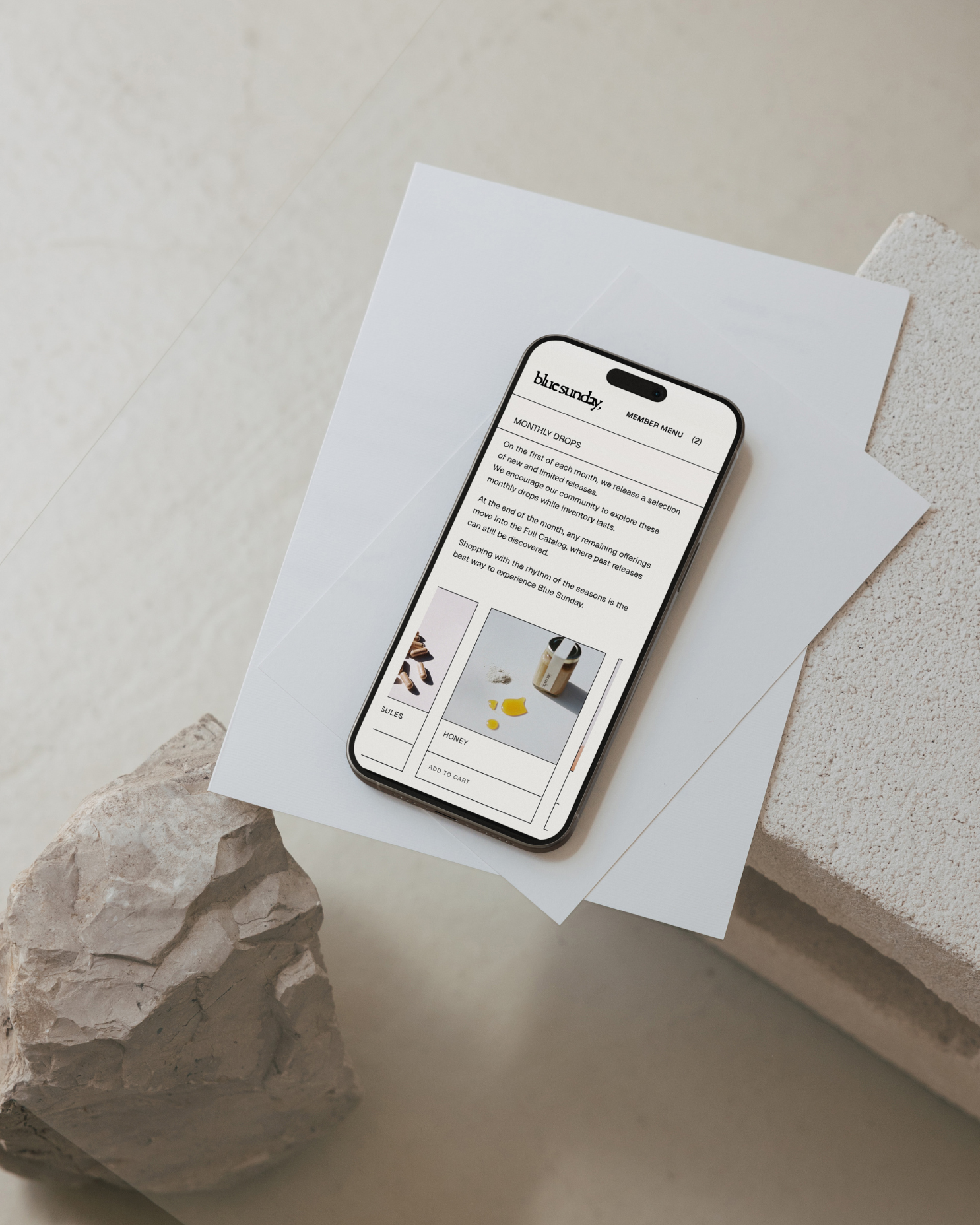
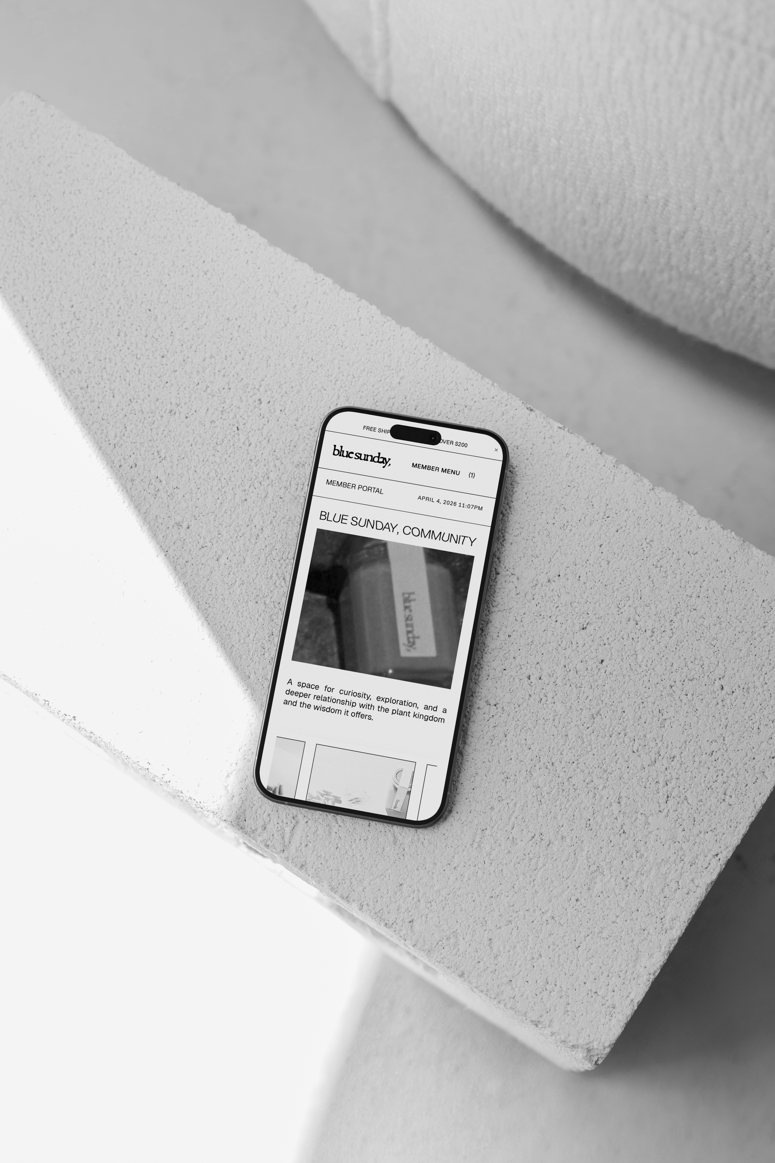
Member Home
Member Home
A minimal, mobile-first layout designed for clarity and flow. The page opens with a concise introduction, leading directly into a curated grid of featured products, allowing users to browse without distraction. Content is stacked and evenly spaced, with clear hierarchy between text and imagery, creating a smooth, scroll-driven experience that feels intuitive, lightweight, and easy to navigate.
04
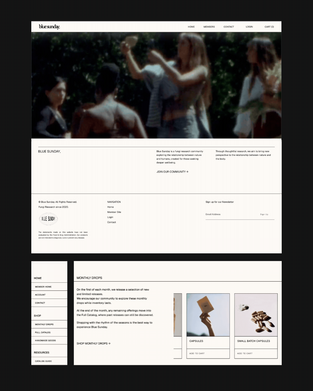
Sitemap
Sitemap
A structured, system-led layout that organizes the site into clear, intentional pathways. Primary navigation is kept simple at the top, while a secondary sidebar introduces a more detailed breakdown of pages, guiding users through Home, Shop, and Resources with clarity. The layout separates discovery from action — editorial content and brand context live in open, spacious sections, while product pathways are contained within a defined grid system. Monthly drops are positioned as a central experience, supported by a consistent product card structure that makes browsing and purchasing seamless. Overall, the system balances hierarchy and flexibility, allowing users to move between exploration and shopping without friction.
Homepage
A restrained, image-led layout designed to feel calm and intuitive. The interface prioritizes visual immersion with a soft, cinematic hero and minimal navigation, allowing content to unfold naturally without friction. Clean typography and generous spacing create clarity, guiding users through the experience with ease while maintaining a refined, grounded presence.
Product Page
A clean, product-focused layout designed for clarity and ease of interaction. The page balances a large, grounded product image on the left with structured information on the right, allowing details, selections, and purchasing actions to feel immediate and intuitive. Minimal styling and generous spacing keep the experience calm and refined, while supporting imagery below adds context without disrupting the flow.
Member Home
A minimal, mobile-first layout designed for clarity and flow. The page opens with a concise introduction, leading directly into a curated grid of featured products, allowing users to browse without distraction. Content is stacked and evenly spaced, with clear hierarchy between text and imagery, creating a smooth, scroll-driven experience that feels intuitive, lightweight, and easy to navigate.
Sitemap
A structured, system-led layout that organizes the site into clear, intentional pathways. Primary navigation is kept simple at the top, while a secondary sidebar introduces a more detailed breakdown of pages, guiding users through Home, Shop, and Resources with clarity. The layout separates discovery from action — editorial content and brand context live in open, spacious sections, while product pathways are contained within a defined grid system. Monthly drops are positioned as a central experience, supported by a consistent product card structure that makes browsing and purchasing seamless. Overall, the system balances hierarchy and flexibility, allowing users to move between exploration and shopping without friction.
05. PRODUCT PAGE
We kept the site clean and elevated, focusing on clarity, restraint, and an intuitive flow that lets the products and philosophy speak for themselves.
The result is a clear, cohesive system that supports both exploration and purchase without friction. It brings structure to the offering while maintaining a calm, elevated feel - creating an experience that is intuitive, considered, and aligned with the essence of Blue Sunday.
SOLUTION