
Joywild Rituals
2026
INDUSTRY
Natural Beauty
Branding, Packaging
SOLUTIONS
Joy Wild Rituals was created to feel like a return - to the body, to nature, to small moments of care that build over time. Through a considered use of color, typography, and composition, the identity was designed to evoke warmth, femininity, and presence. Every detail supports a sense of calm assurance, allowing the brand to feel both elevated and deeply human.
SUMMARY
Joywild exists to bring joy back into the everyday act of caring for the body. Rooted in the intelligence of plants and the rhythm of daily life, the brand creates skincare that invites presence, softness, and a sense of ease.
ETHOS


01
Packaging Tape
02
Cotton Drawstring Bag
03
Envelope Design
04
Canvas Zipperbag
01
Packaging Tape
Packaging Tape
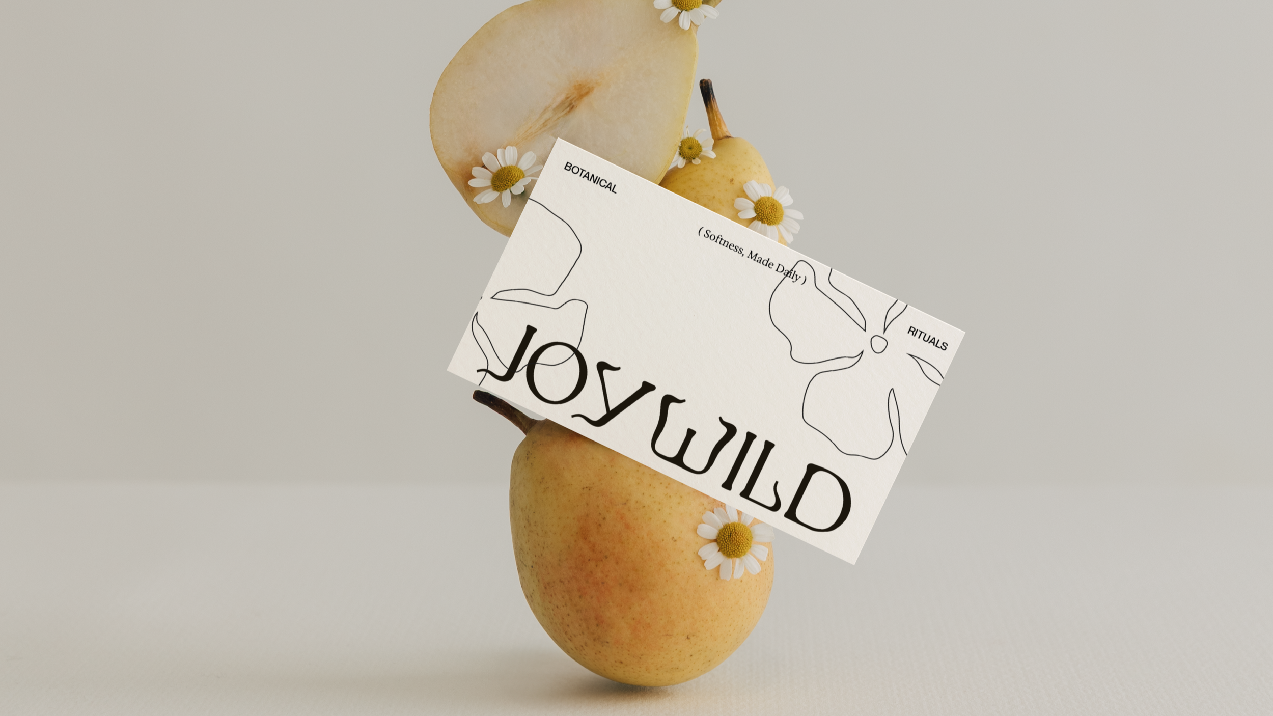
A refined custom wordmark with softly flared, organic letterforms that feel both grounded and expressive, symbolic of feminine curves and body shapes. The subtle curvature and irregularity give it a natural, slightly untamed character while maintaining a clean, elevated presence.
02
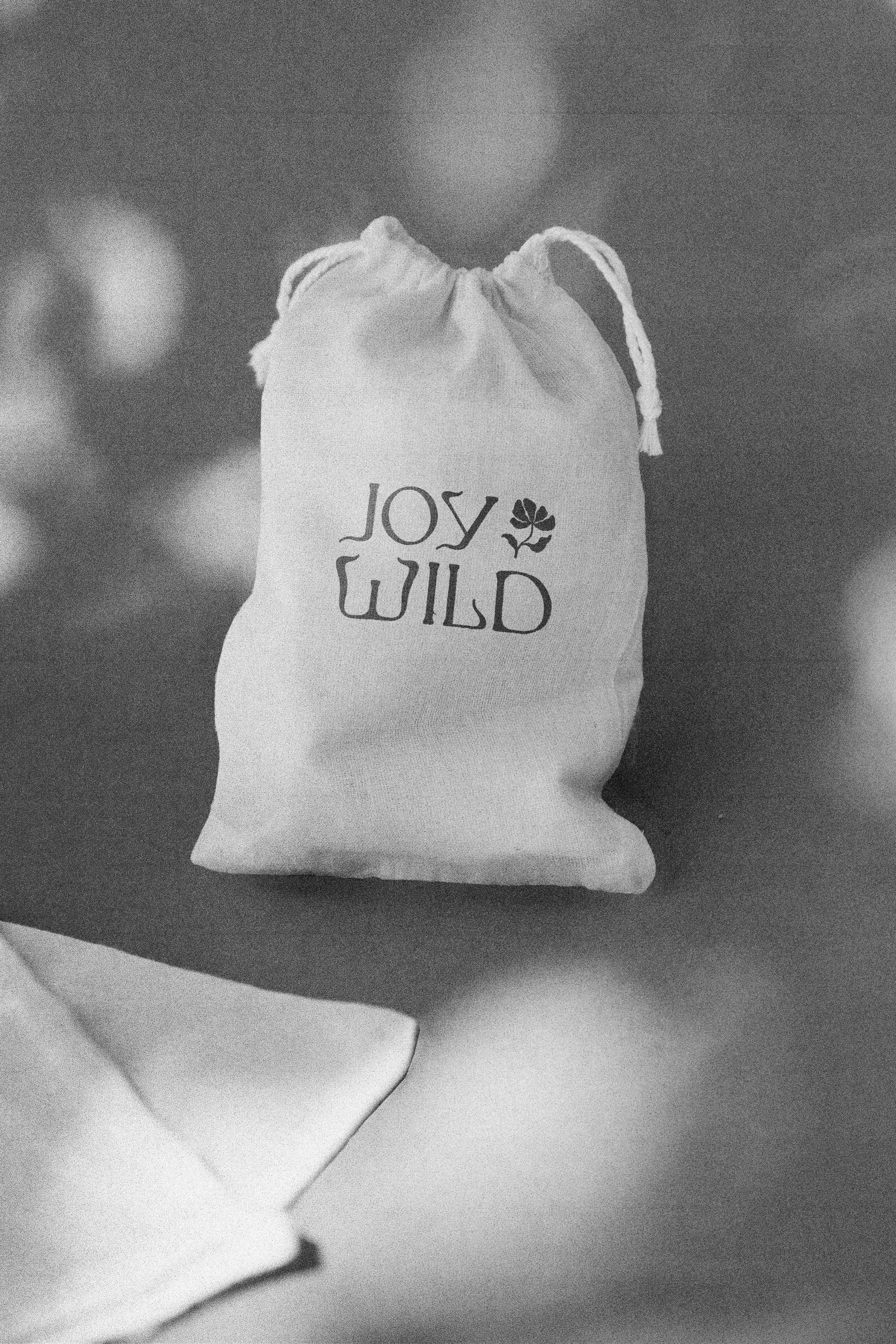
Cotton Drawstring Bag
Cotton Drawstring Bag
A softly expressive wordmark set in an organic serif, paired with a delicate floral brandmark.
03
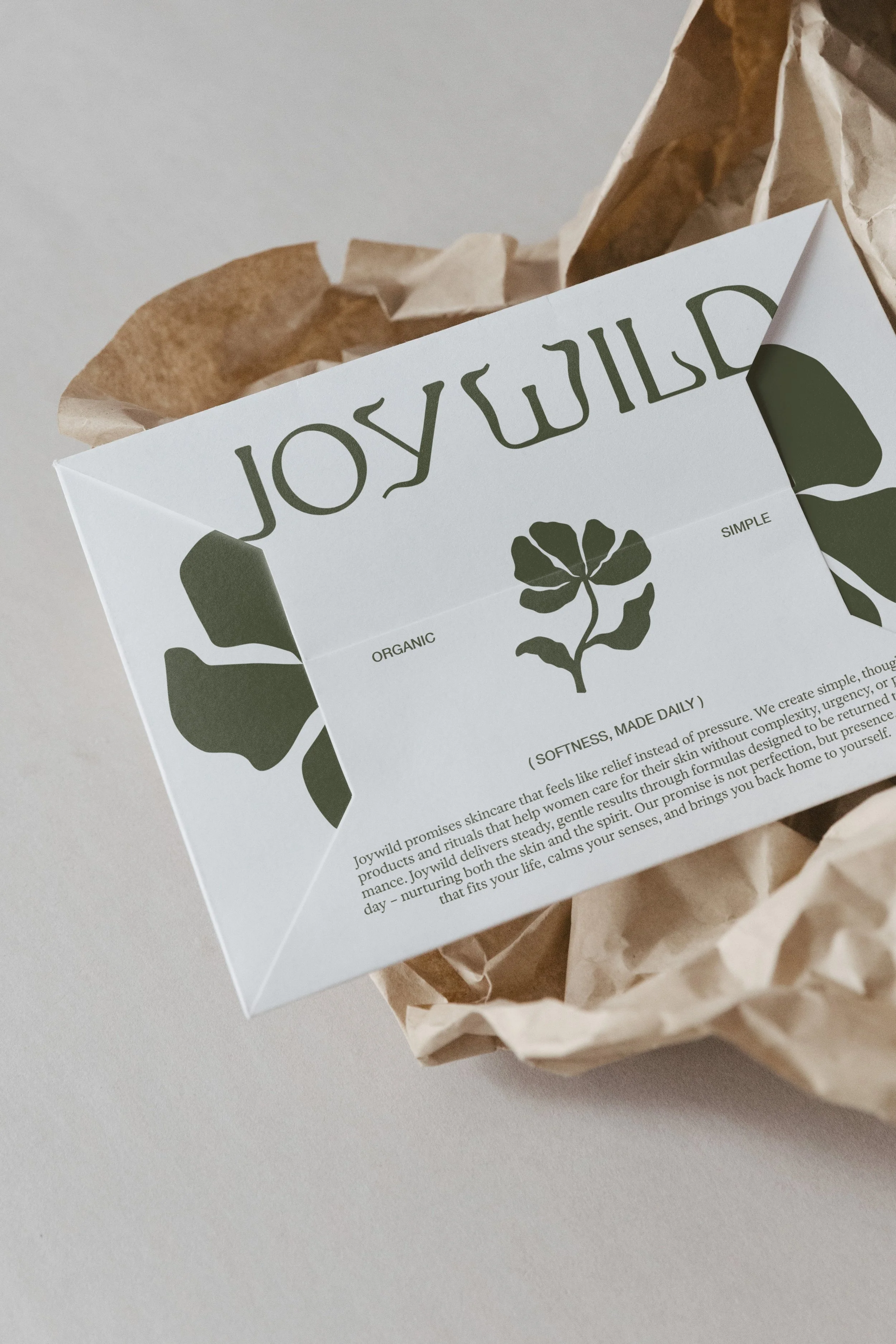
Envelope Design
Envelope Design
A clean, minimal envelope design centered on soft contrast and natural form. The muted green botanical graphic wraps subtly across panels, creating a sense of continuity, while the refined serif wordmark anchors the composition with quiet confidence.
04
Canvas Zipperbag
Canvas Zipperbag
A custom wordmark with softly flared, organic letterforms that feel both grounded and expressive. The subtle curvature and irregularity give it a natural, slightly untamed character while maintaining a clean, elevated presence.
Packaging Tape
A refined custom wordmark with softly flared, organic letterforms that feel both grounded and expressive, symbolic of feminine curves and body shapes. The subtle curvature and irregularity give it a natural, slightly untamed character while maintaining a clean, elevated presence.
Cotton Drawstring Bag
A softly expressive wordmark set in an organic serif, paired with a delicate floral brandmark.
Envelope Design
A clean, minimal envelope design centered on soft contrast and natural form. The muted green botanical graphic wraps subtly across panels, creating a sense of continuity, while the refined serif wordmark anchors the composition with quiet confidence.
Canvas Zipperbag
A custom wordmark with softly flared, organic letterforms that feel both grounded and expressive. The subtle curvature and irregularity give it a natural, slightly untamed character while maintaining a clean, elevated presence.
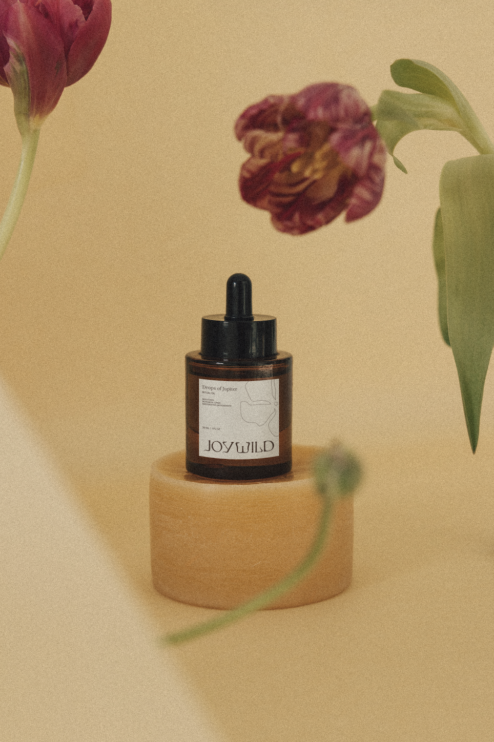
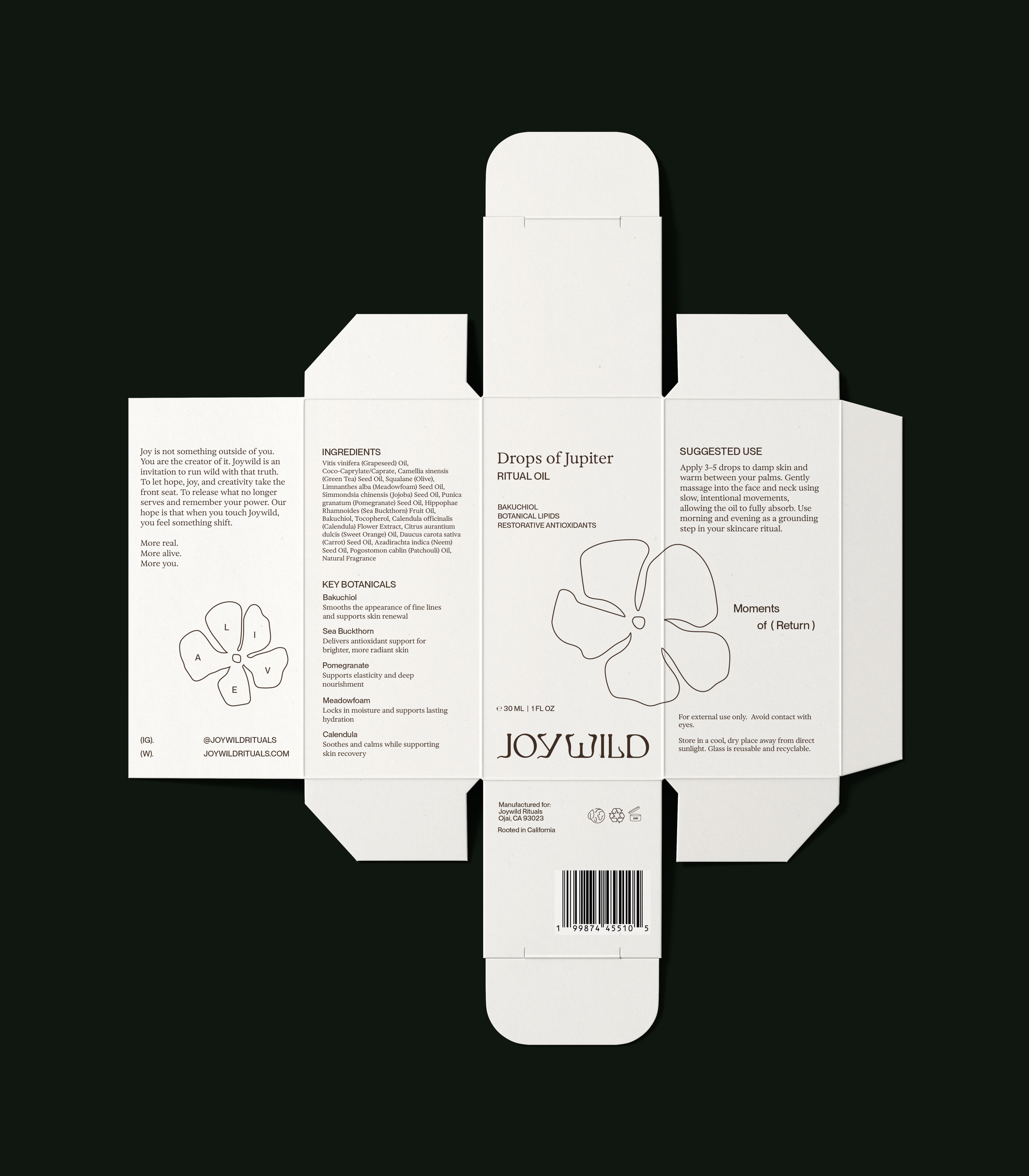
05. DROPS OF JUPITER
A minimal, softly structured label that pairs delicate linework with refined serif typography. The composition feels calm and intentional, with generous spacing and subtle organic illustration, grounded by the expressive Joywild wordmark for a quiet, elevated finish.
TOTE BAG DESIGN
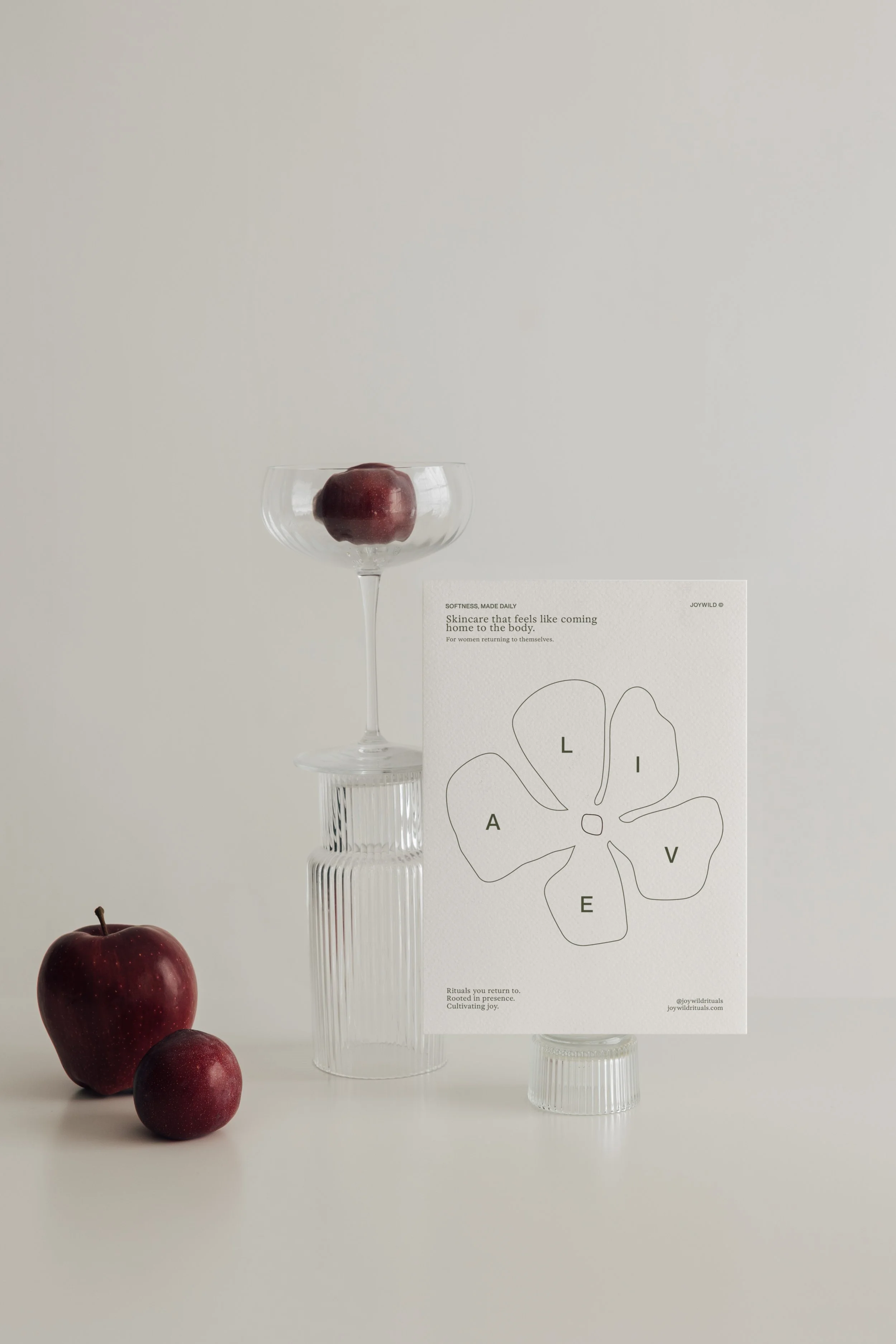
05. PRINTED CARD
A minimal, editorial-style card centered on softness and clarity. A delicate line-drawn floral form anchors the composition, with spaced lettering woven into each petal, creating a quiet visual rhythm. The typography is refined and understated, supported by generous negative space and subtle hierarchy, giving the piece a calm, grounded, and elevated presence.
The result is a cohesive identity system rooted in softness, intention, and natural form—where typography, illustration, and materiality work together to create a brand that feels both elevated and deeply human.
SOLUTION