
Known
2026
INDUSTRY
Natural Beauty
Branding, Packaging
SOLUTIONS
The goal for KNOWN was to create a clean, elevated identity rooted in nature and clarity. The brand needed to feel refined and intentional, while still reflecting the purity and integrity of its formulations.
SUMMARY

KNOWN is rooted in the intelligence of plants - not as a trend, but as a foundation. Each formulation begins with raw materials chosen for their biological function and compatibility with the skin, drawing from plant oils, extracts, and compounds that have been used, studied, and refined over time. The approach is not to overwhelm the skin, but to support it - working with its natural processes rather than against them.
ETHOS


01
Cleansing Oil Label
02
Packaging Tape
03
Serum Label
04
Mailer Box
01
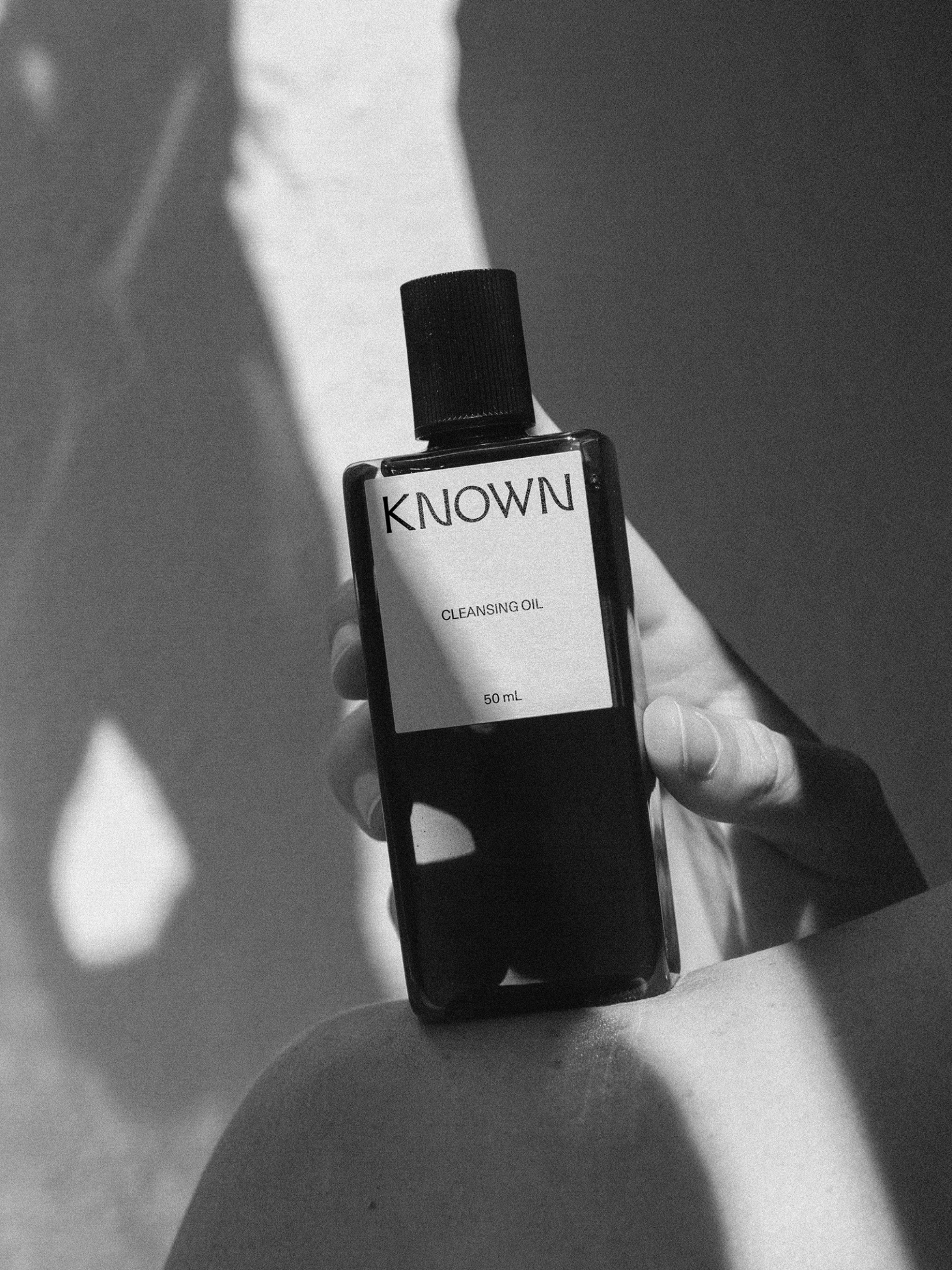
Cleansing Oil Label
Cleansing Oil Label
The KNOWN Cleansing Oil label is designed with restraint, allowing clarity to lead. A simple, centered wordmark anchors the composition, creating a strong point of focus while maintaining a sense of quiet confidence. Supporting information is kept minimal and deliberately spaced, reinforcing a feeling of order and precision.
02
Packaging Tape
Packaging Tape
A minimal, highly considered packaging tape that turns a functional element into a brand signature.
03
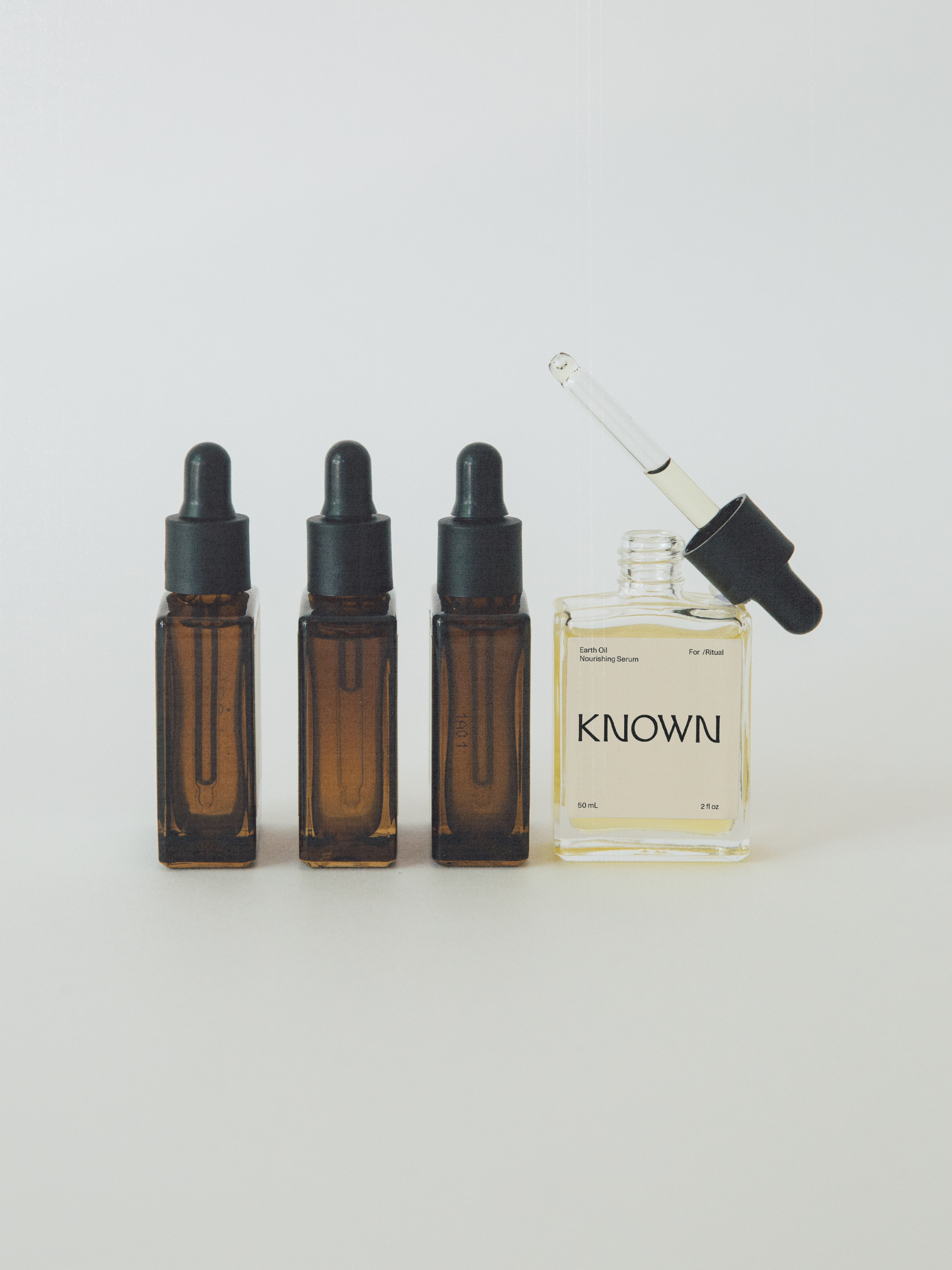
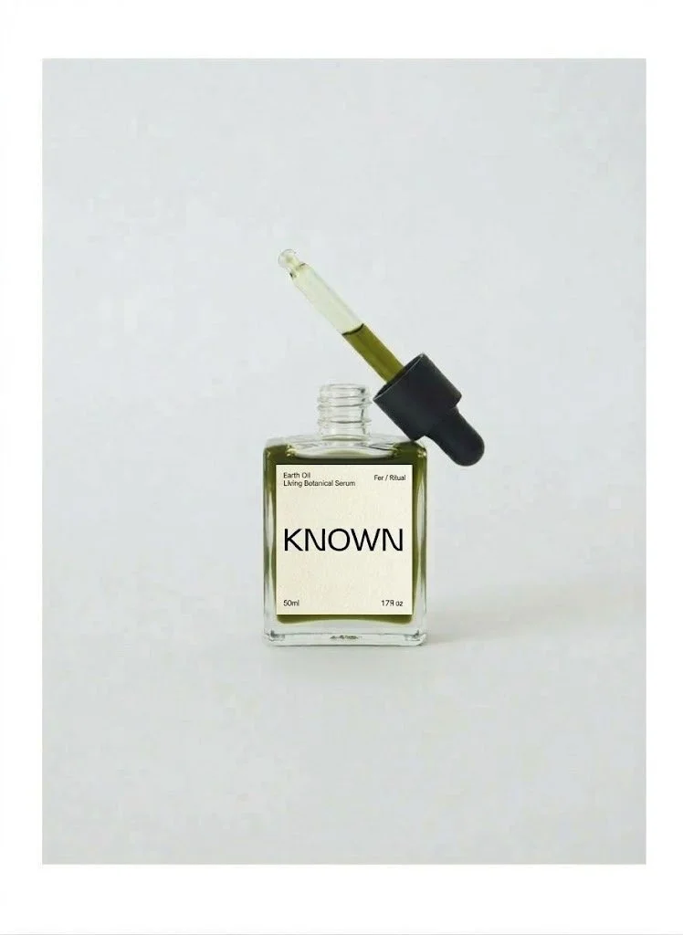
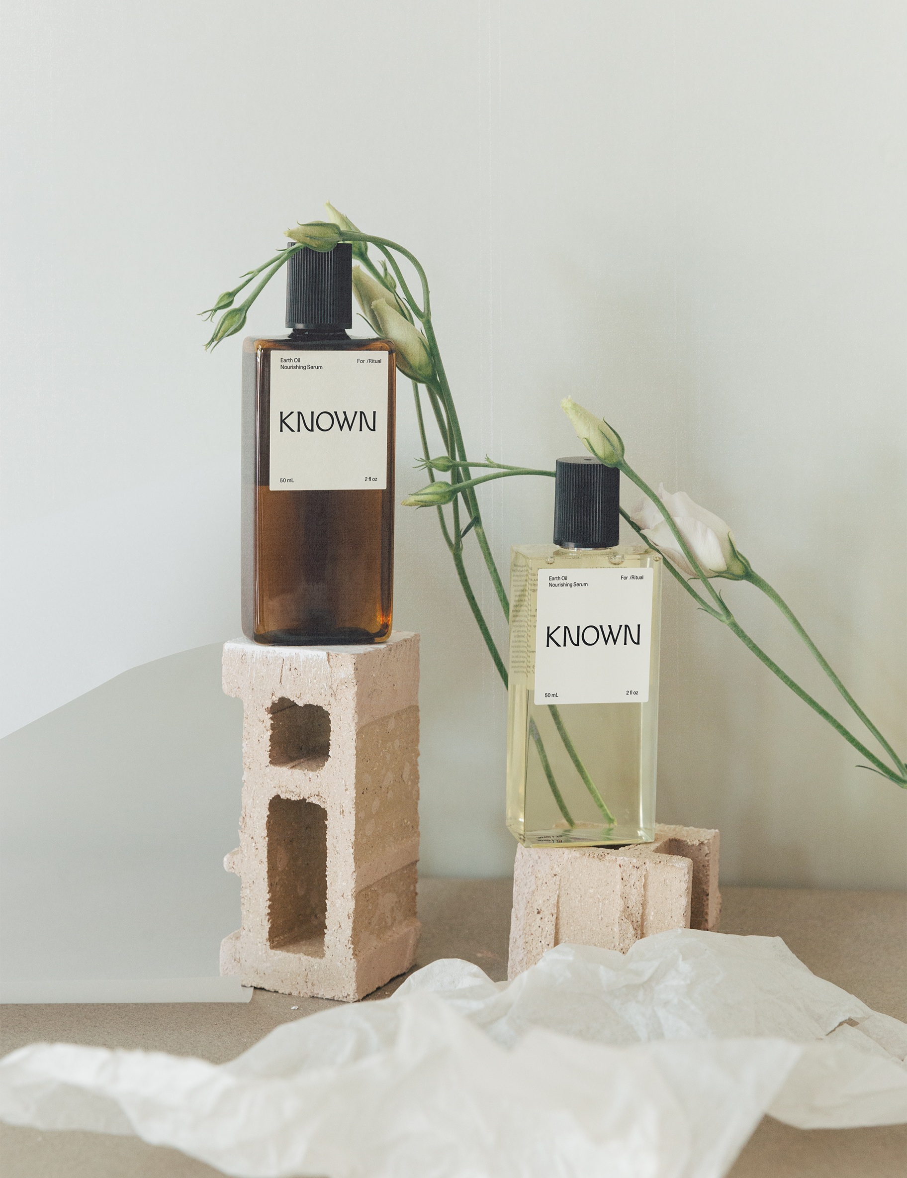
Serum Label
Serum Label
The Earth Oil label is designed with clarity and precision at its core. A clean, centered wordmark anchors the bottle, creating a strong focal point while maintaining a sense of quiet restraint. Supporting details are minimal and intentionally placed, allowing the information to feel structured without overwhelming the composition.
04
Mailer Box
Mailer Box
The mailer box is designed with simplicity and material honesty at the forefront. A natural kraft surface provides a raw, uncoated texture that feels grounded and intentional, aligning with the brand's botanical foundation. Branding is reduced to a single, minimal label — placed with precision — allowing the identity to feel quiet yet distinct. The structure is clean and functional, emphasizing ease of use while maintaining a refined presence.
Cleansing Oil Label
The KNOWN Cleansing Oil label is designed with restraint, allowing clarity to lead. A simple, centered wordmark anchors the composition, creating a strong point of focus while maintaining a sense of quiet confidence. Supporting information is kept minimal and deliberately spaced, reinforcing a feeling of order and precision.
Packaging Tape
A minimal, highly considered packaging tape that turns a functional element into a brand signature.
Serum Label
The Earth Oil label is designed with clarity and precision at its core. A clean, centered wordmark anchors the bottle, creating a strong focal point while maintaining a sense of quiet restraint. Supporting details are minimal and intentionally placed, allowing the information to feel structured without overwhelming the composition.
Mailer Box
The mailer box is designed with simplicity and material honesty at the forefront. A natural kraft surface provides a raw, uncoated texture that feels grounded and intentional, aligning with the brand's botanical foundation. Branding is reduced to a single, minimal label — placed with precision — allowing the identity to feel quiet yet distinct. The structure is clean and functional, emphasizing ease of use while maintaining a refined presence.
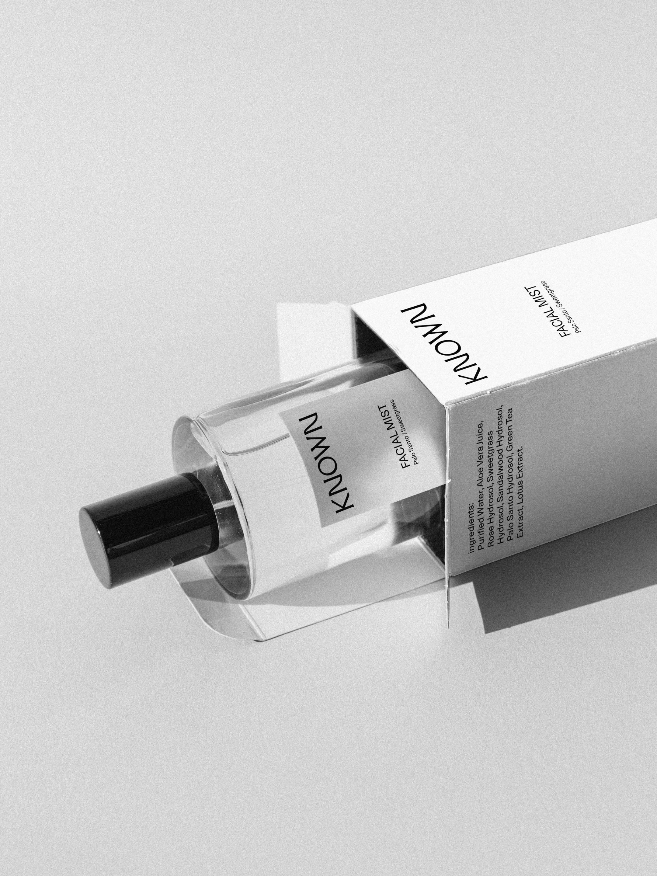
05. FACIAL MIST
A minimal, typography-led packaging system designed for clarity and impact. Clean labels and structured type create a refined, editorial feel, while the transparency of the bottle and simple carton allow the product to remain the focus. The overall design is sharp, intentional, and quietly elevated.
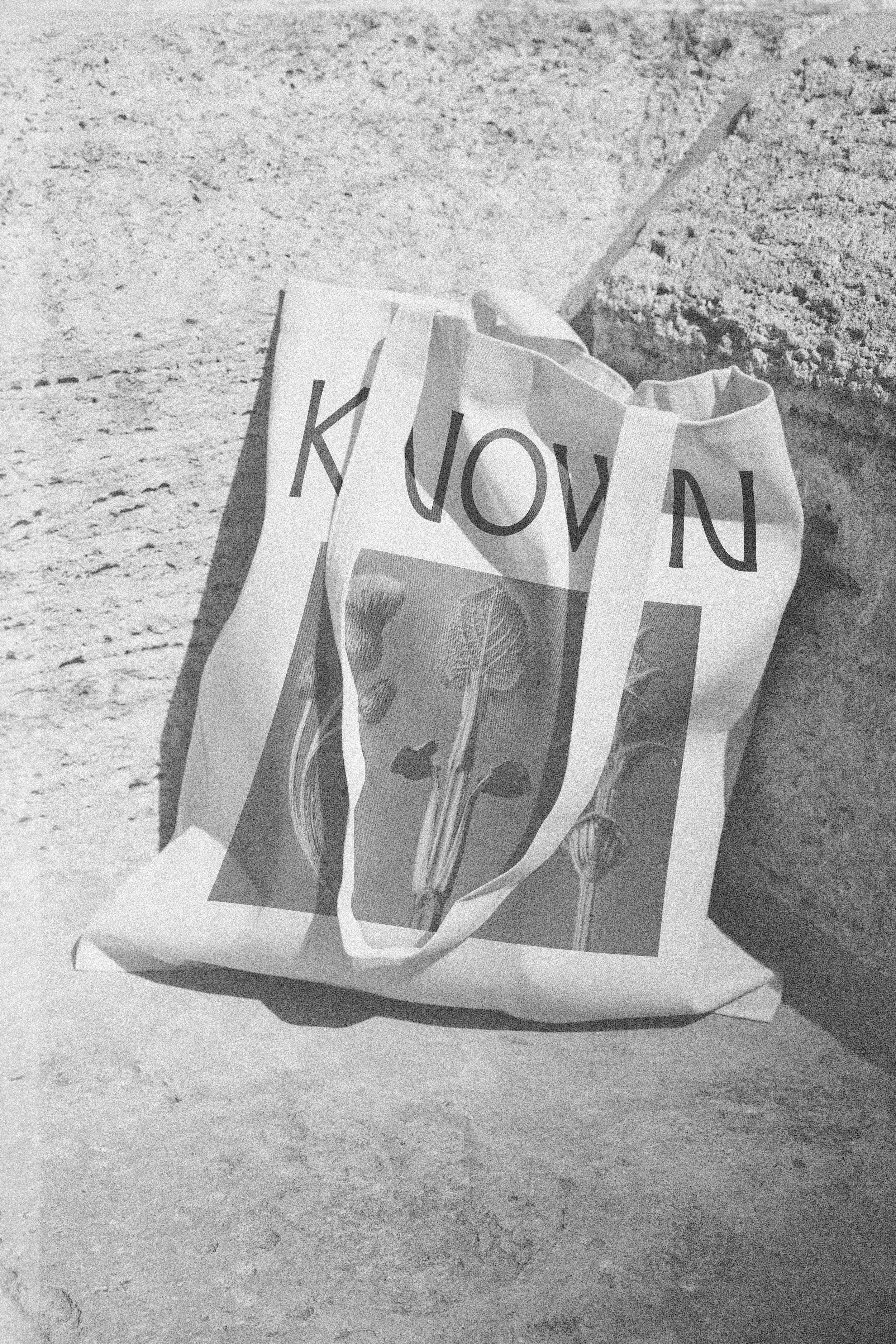
TOTE BAG DESIGN
05. FACIAL MIST
The Earth Oil label is designed with clarity and precision at its core. A clean, centered wordmark anchors the bottle, creating a strong focal point while maintaining a sense of quiet restraint. Supporting details are minimal and intentionally placed, allowing the information to feel structured without overwhelming the composition.
The result is a cohesive, refined system that brings clarity to both product and brand. Every element - from identity to packaging - is considered and reduced to its most essential form, creating an experience that feels elevated, intentional, and grounded in trust.
SOLUTION