

( NHYT )
ABOUT
NHYT is a modern skincare brand rooted in elemental beauty and the pursuit of balance. We created a refined identity and visual language that blend natural minimalism with quiet sophistication, evoking a sense of clarity, calm, and connection to the natural world. Every detail — from typography to tone — was considered to reflect NHYT’s philosophy of simplicity as luxury, where purity and intention shape the foundation of modern self-care.
STRATEGY / IDENTITY / VISUAL SYSTEM / PRINT
2025

Where Nature meets nuance.

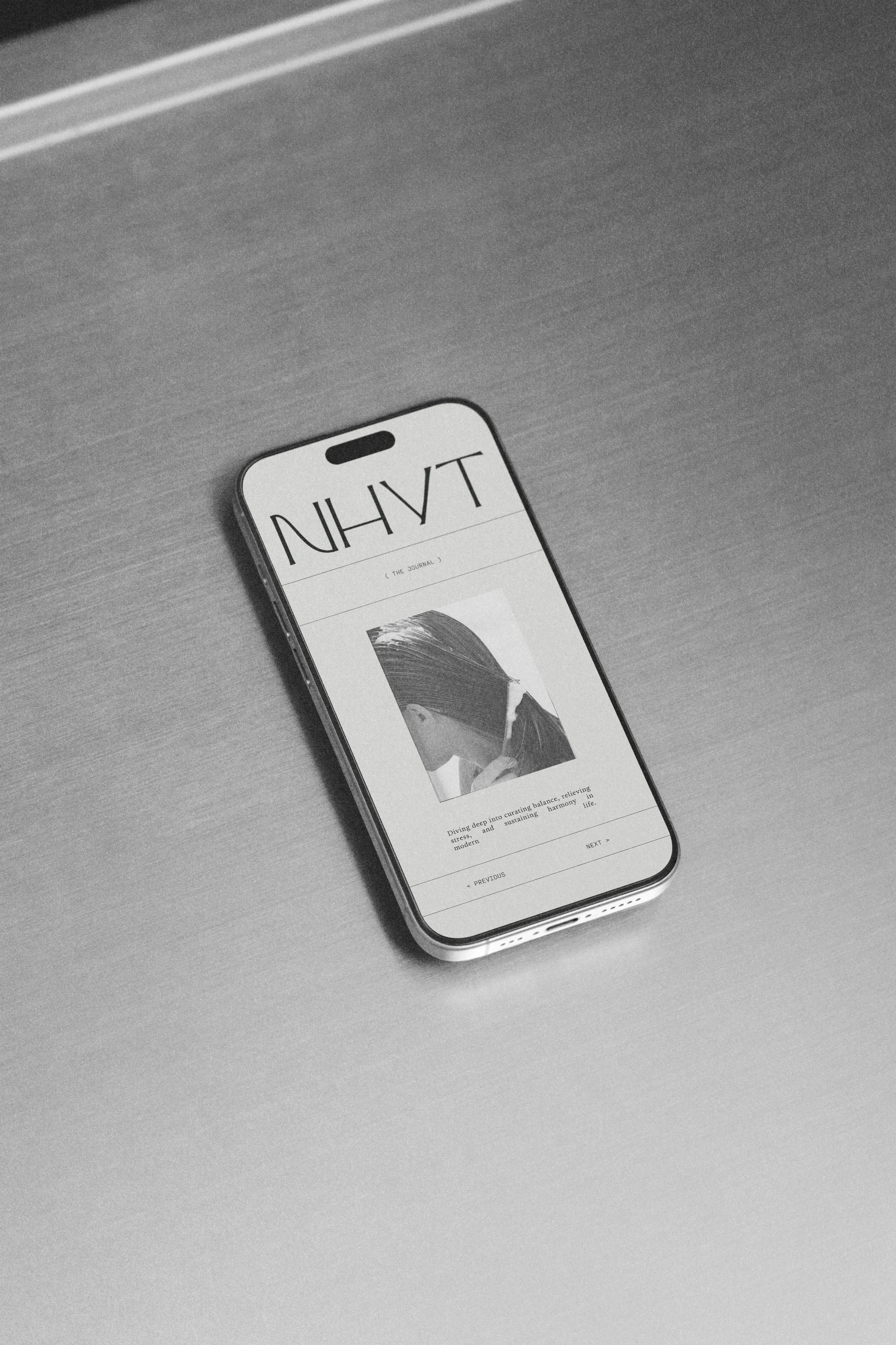
The NHYT wordmark was designed as an expression of restraint and refinement — an elemental form that mirrors the brand’s balance between purity and modernity. Each letterform is drawn with deliberate tension: thin, architectural lines intersect with subtle curvature, creating a sense of both stillness and movement.

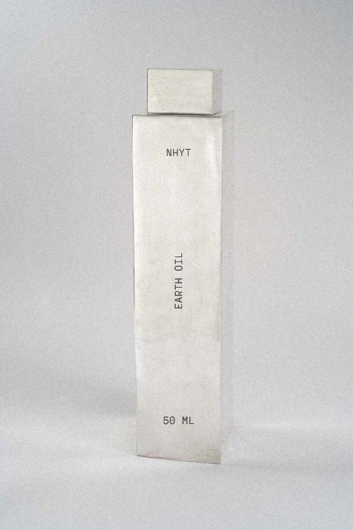
For NHYT, we designed refined print collateral and stainless steel packaging renders that reflect the brand’s modern purity and quiet sophistication. As part of the scope, we developed a complete identity suite that embodies the same ethos: clean, grounded, and reverent to the form itself. Each element was crafted as a quiet vessel for the brand’s story, offering clarity and restraint in equal measure.

Typography and composition were carefully considered to create a brand experience that is both refined and expressive. The packaging follows the same philosophy, with subtle textures and finishes that enhance the sensory experience, making each interaction with the brand feel intentional and immersive.
The result is a brand identity that feels both fresh and timeless — a visual system that holds space for the object, while elevating it into a new kind of luxury. One rooted in the earth, shaped by hand, and made to be felt.
( INQUIRE )
Breathe life into your vision with a partner who sees things differently.
NEWSLETTER
Sign up for our newsletter to receive thoughtful updates on process, inspiration, and recent work.
CONNECT
hello@byearthe.co