

( PRIMORDIA )
ABOUT
Primordia is a skincare line shaped by instinct, memory, and botanical intelligence. Rooted in the textures of the jungle and the quiet power of the body, the brand called for an identity that felt both unearthed and upscale — a visual system that could hold ritual, wildness, and luxury in equal measure. Our task was to distill this essence into a considered design language — one that feels intimate, textural, and enduring.
STRATEGY / IDENTITY / VISUAL SYSTEM
2025

Botanical intelligence for the body remembered.

The Primordia logotype is a bespoke wordmark that balances elegance with a sense of unearthed origin. Each letterform is drawn with high contrast — long vertical strokes meet delicate serifs, creating a tension between refinement and wildness. The exaggerated arches and sweeping terminals in characters like R, D, and A introduce a fluid, almost calligraphic rhythm. The secondary mark, intentionally stacked in two lines, the composition feels monumental — a contemporary take that speaks to both body and time.
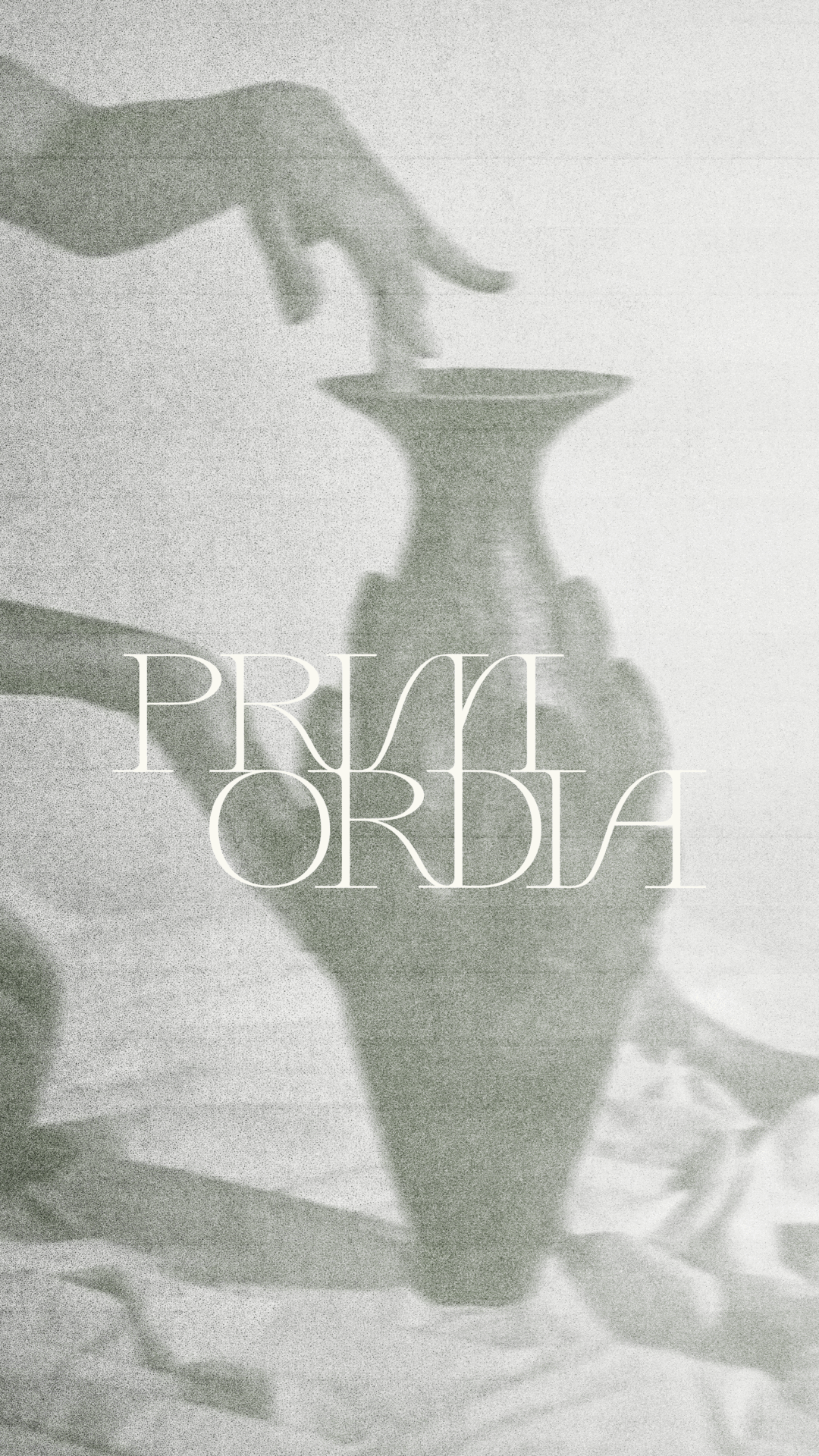
The creative direction draws from aged film, archival photographs, and cultural artifacts — an atmosphere of lived history and quiet ritual. Imagery evokes a sense of timeworn beauty, referencing ancient practices and places where nature still governs. A visual world that embodies the brand’s maxim: of the first nature.
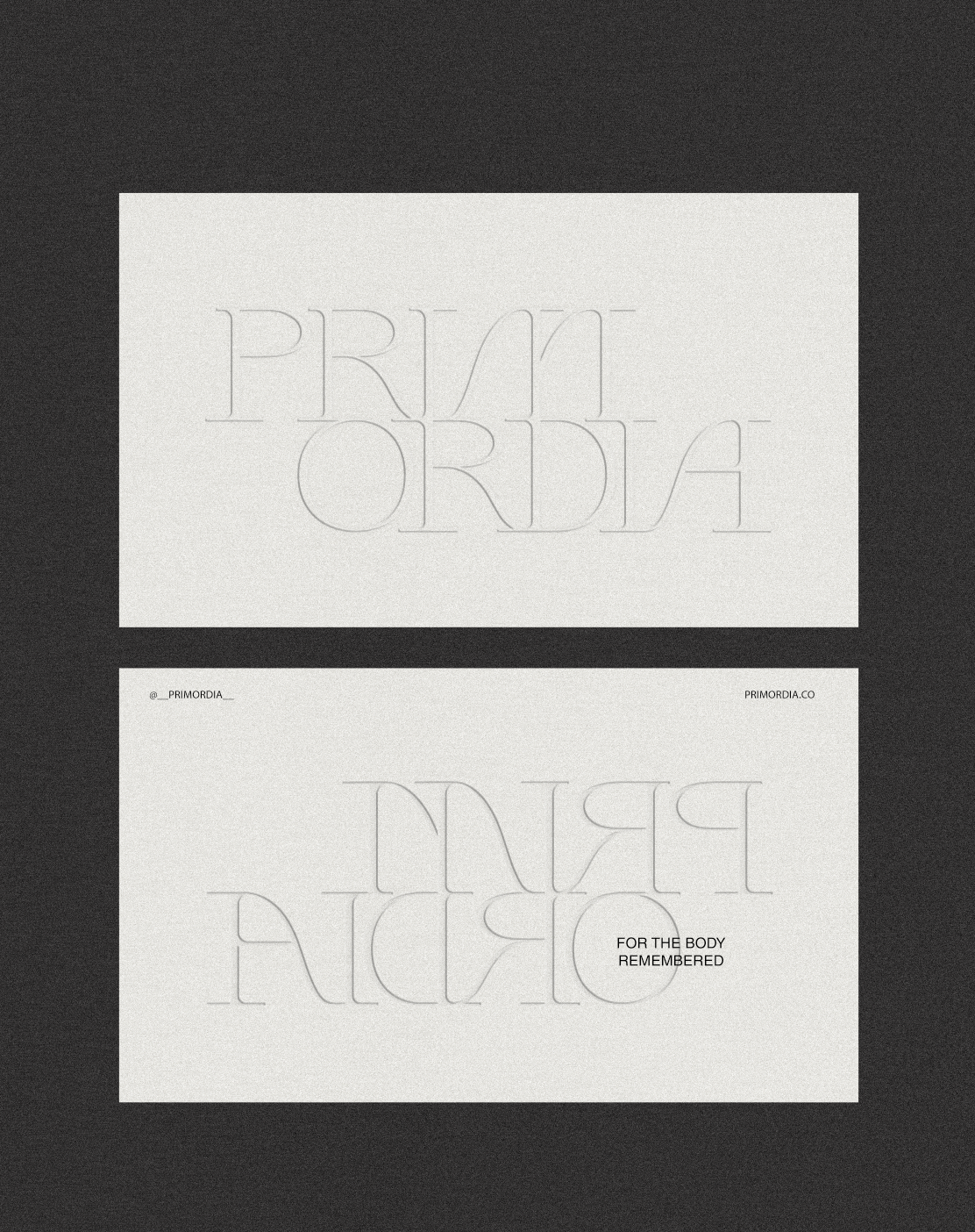

Packaging and collateral were kept intentionally minimal — an exercise in restraint that lets texture lead. Blind embossing became the primary gesture, offering quiet dimensionality and visual intrigue. Every element was designed to communicate through presence — a sense of returning to our original nature. The brand’s ethos made tangible.


( INQUIRE )
Breathe life into your vision with a partner who sees things differently.
NEWSLETTER
Sign up for our newsletter to receive thoughtful updates on process, inspiration, and recent work.
CONNECT
hello@byearthe.co