
Vis Natura
2026
INDUSTRY
Homeopathy
Branding, Creative Direction, Packaging
SOLUTIONS
Vis Natura is a brand identity project centered on a system of plant, mineral, and elemental essences. The goal was to create a clear, structured framework that translates complex, often abstract concepts into something grounded and usable. The result is a cohesive visual and messaging system that emphasizes consistency, classification, and experience over time.
SUMMARY
Vis Natura is grounded in the belief that understanding develops through relationship, not intensity. Rather than offering isolated solutions, the brand is built as a system that encourages consistent use, observation, and familiarity over time. It values clarity, structure, and restraint, allowing the body to respond naturally rather than be pushed or overwhelmed. Through this approach, Vis Natura creates a more considered and continuous way of engaging with plant, mineral, and elemental essences.
ETHOS


01
Essence Bottle Design
02
Primary Wordmark
03
Embossed Brandmark
04
Essence Room Spray Design
01
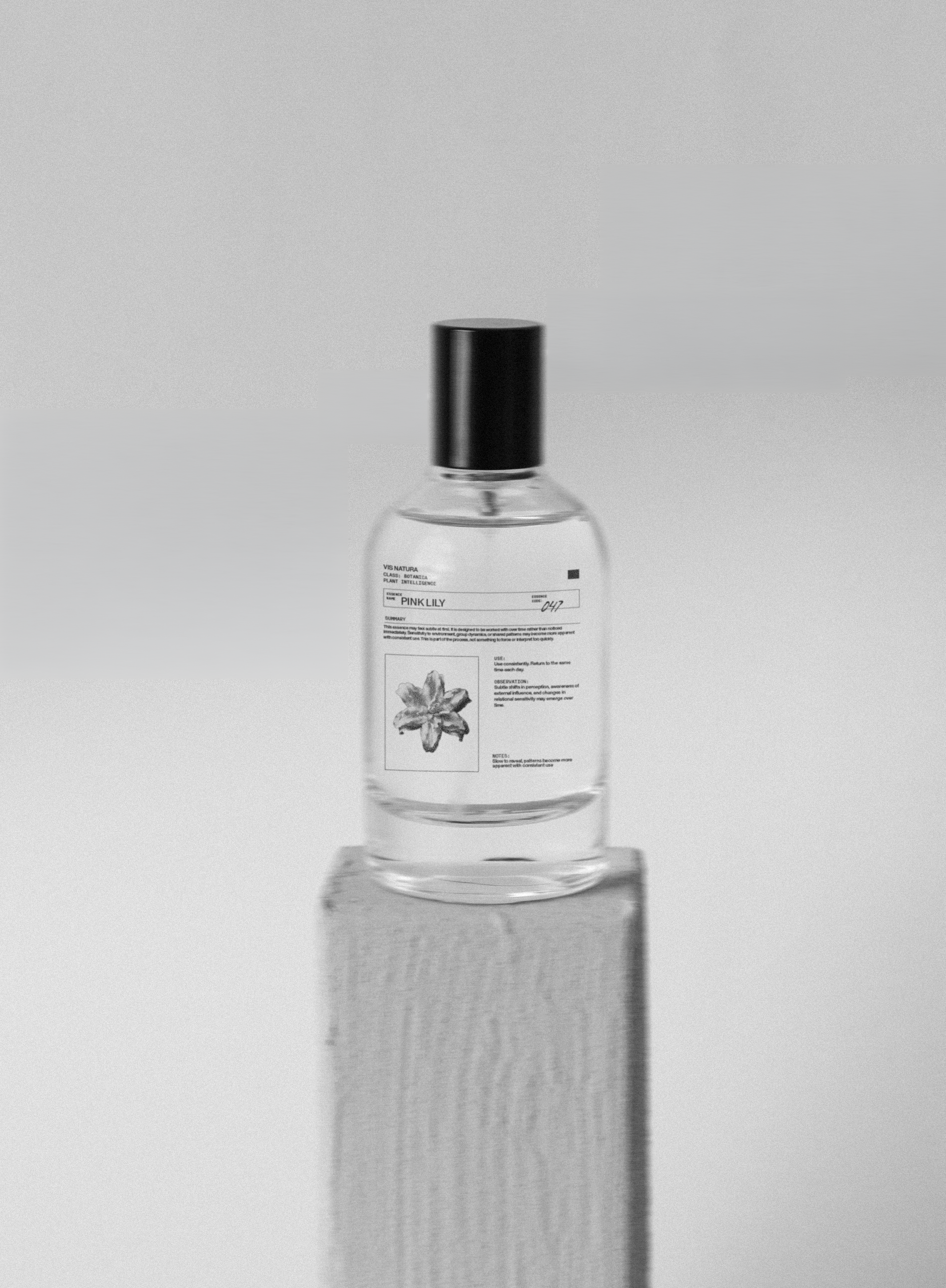
Essence Bottle Design
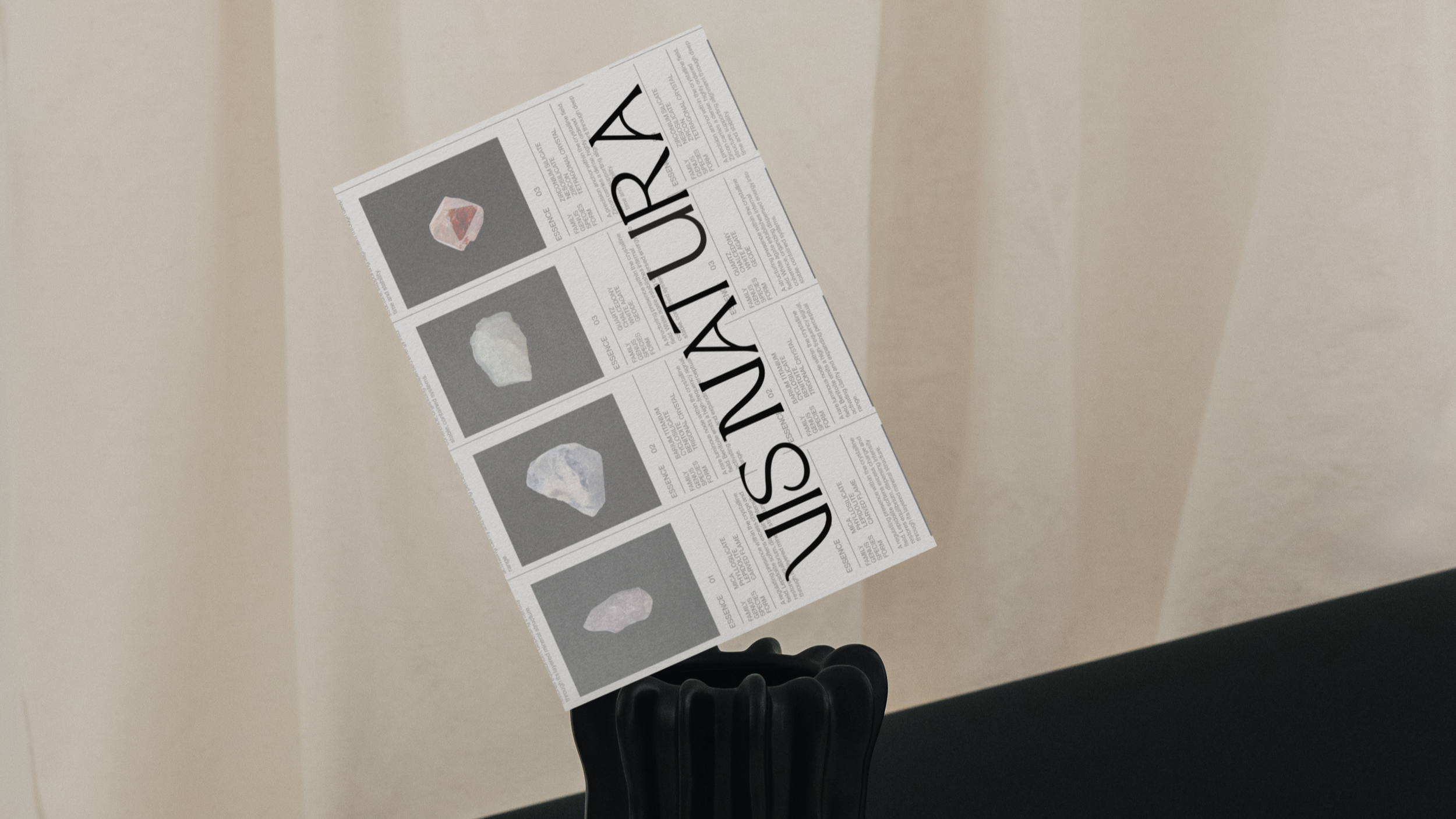
Essence Bottle Design
The label follows a structured, scientific layout with clear hierarchy - batch details, usage, and composition organized through fine rules and minimal typography. A small collection image anchors each design, paired with a handwritten note that adds a subtle human touch. Each essence is part of a color-coordinated system, where the imagery and accents shift to reflect its unique composition while maintaining a consistent, unified framework.
02
Primary Wordmark
Primary Wordmark
The Vis Natura wordmark is built on a refined, customized serif that conveys clarity, structure, and a sense of permanence. Its sharp details and balanced proportions give it authority, while subtle custom adjustments introduce a distinct, ownable character. The result is a mark that feels rooted and intentional, without appearing overly ornate or traditional. It serves as the anchor of the identity, representing the system and its underlying structure. At the same time, its nuanced details allow it to carry a sense of depth, reflecting the experiential layer of the brand.
03
Embossed Brandmark
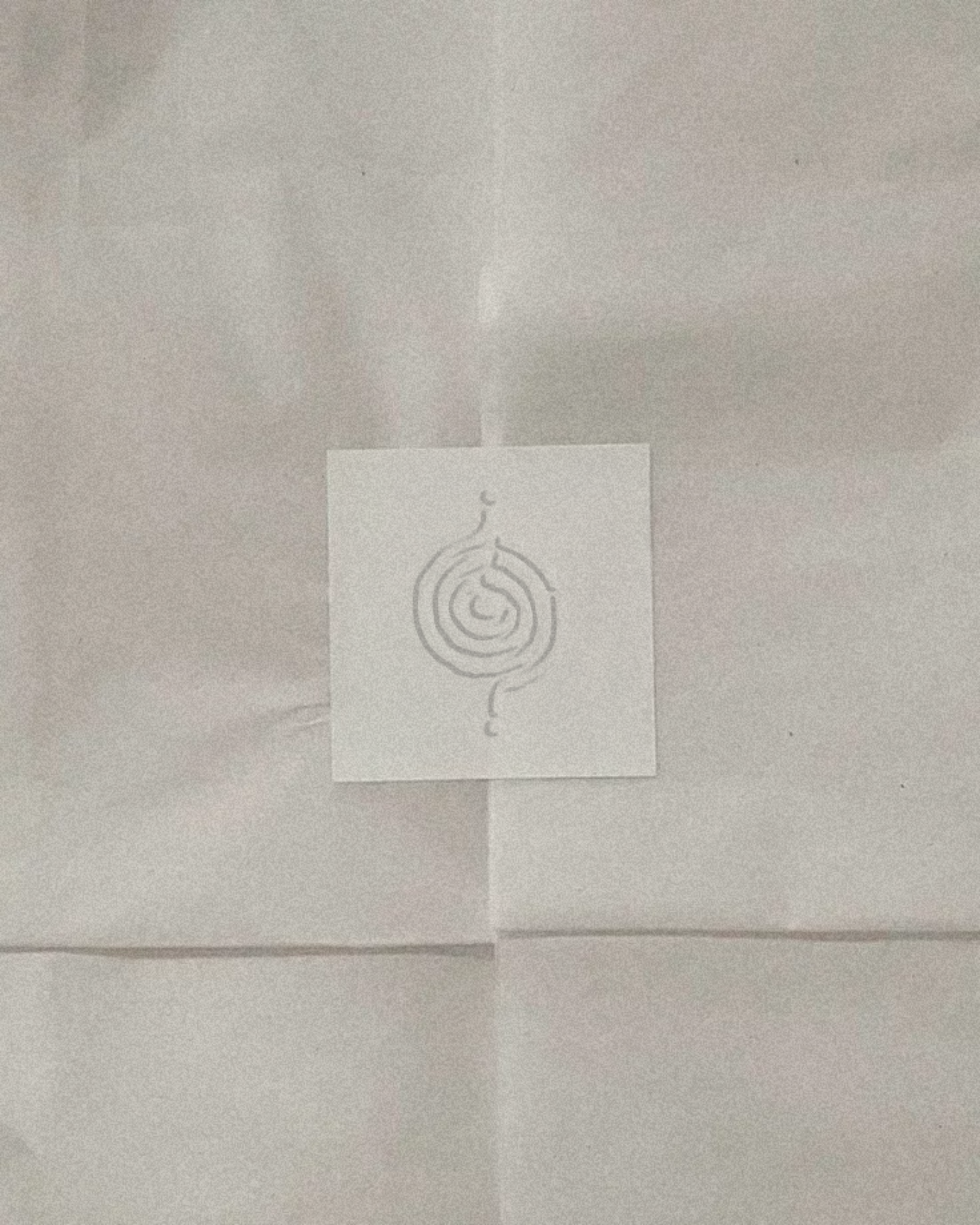
Embossed Brandmark
The brand mark is a refined spiral labyrinth built from a single continuous line. It's balanced and geometric, with slight organic variation to keep it from feeling rigid. The form represents movement inward and outward - a system of flow, return, and progression. It works as a clear visual anchor across the brand, translating well across print, embossing, and packaging.
04
Essence Room Spray Design
Essence Room Spray Design
The label follows a structured, scientific layout with clear hierarchy - batch details, usage, and composition organized through fine rules and minimal typography. A small collection image anchors each design, paired with a handwritten note that adds a subtle human touch. Each essence is part of a color-coordinated system, where the imagery and accents shift to reflect its unique composition while maintaining a consistent, unified framework.
Essence Bottle Design
The label follows a structured, scientific layout with clear hierarchy - batch details, usage, and composition organized through fine rules and minimal typography. A small collection image anchors each design, paired with a handwritten note that adds a subtle human touch. Each essence is part of a color-coordinated system, where the imagery and accents shift to reflect its unique composition while maintaining a consistent, unified framework.
Primary Wordmark
The Vis Natura wordmark is built on a refined, customized serif that conveys clarity, structure, and a sense of permanence. Its sharp details and balanced proportions give it authority, while subtle custom adjustments introduce a distinct, ownable character. The result is a mark that feels rooted and intentional, without appearing overly ornate or traditional. It serves as the anchor of the identity, representing the system and its underlying structure. At the same time, its nuanced details allow it to carry a sense of depth, reflecting the experiential layer of the brand.
Embossed Brandmark
The brand mark is a refined spiral labyrinth built from a single continuous line. It's balanced and geometric, with slight organic variation to keep it from feeling rigid. The form represents movement inward and outward - a system of flow, return, and progression. It works as a clear visual anchor across the brand, translating well across print, embossing, and packaging.
Essence Room Spray Design
The label follows a structured, scientific layout with clear hierarchy - batch details, usage, and composition organized through fine rules and minimal typography. A small collection image anchors each design, paired with a handwritten note that adds a subtle human touch. Each essence is part of a color-coordinated system, where the imagery and accents shift to reflect its unique composition while maintaining a consistent, unified framework.
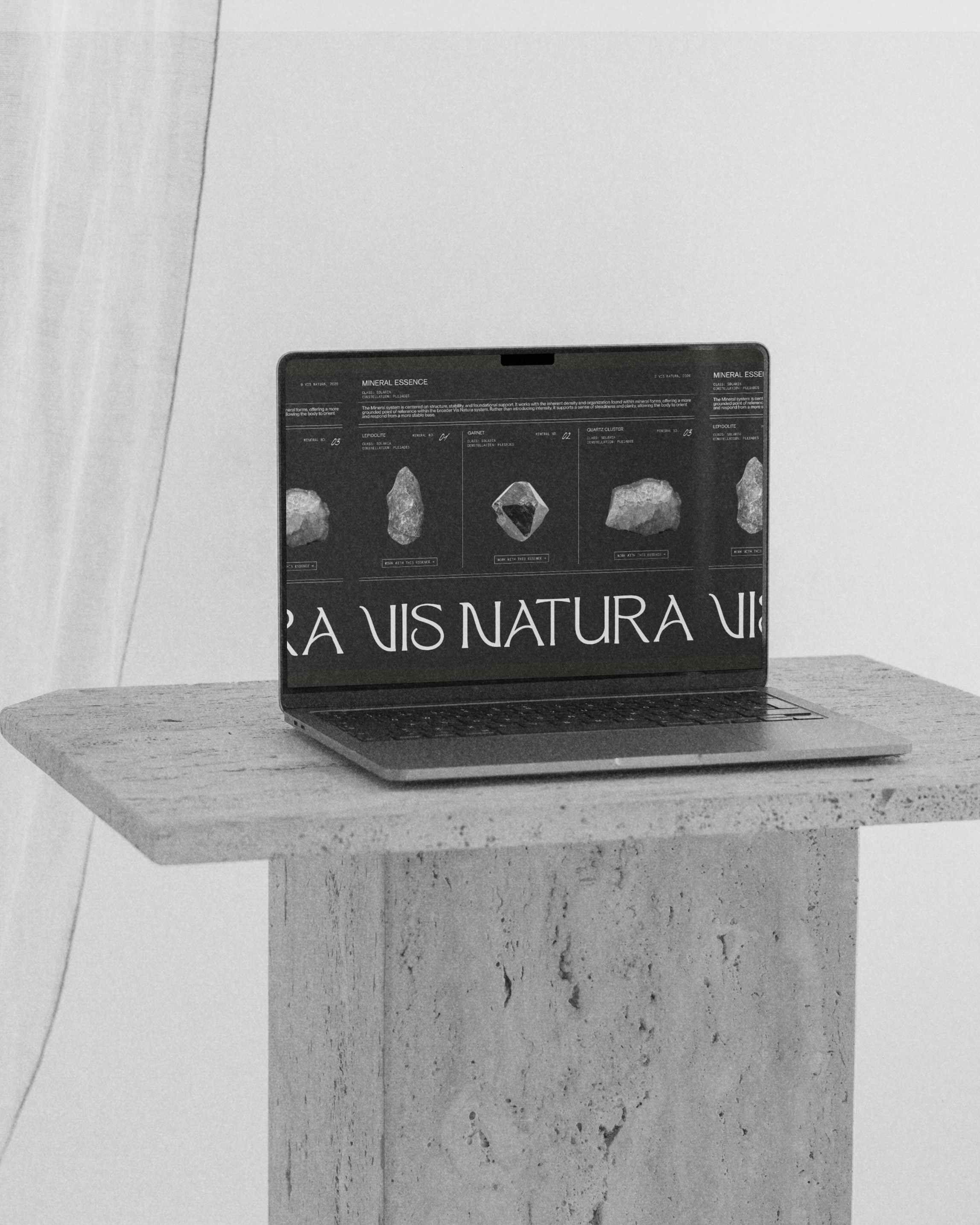
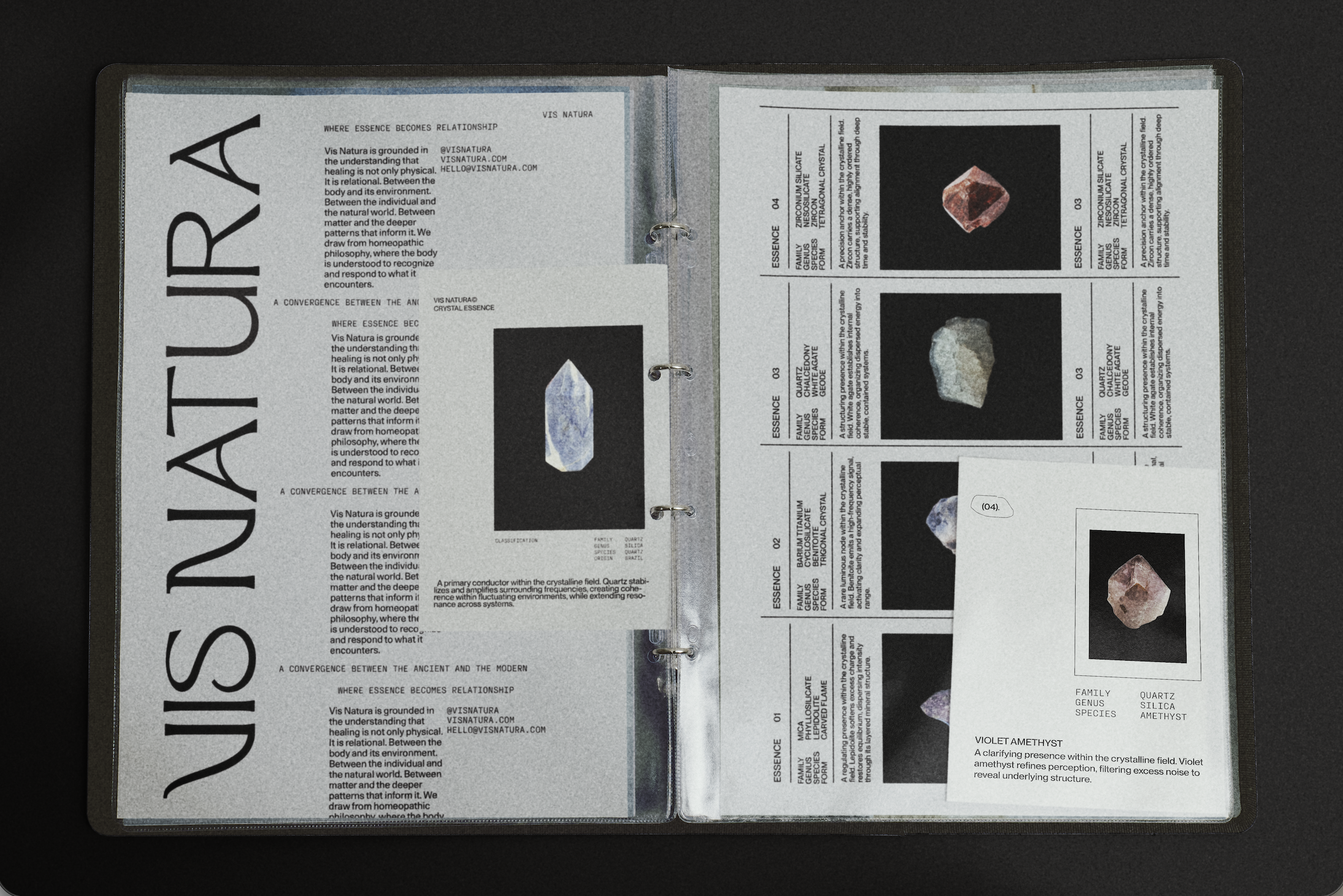
05. LAYOUT STRUCTURE
The Vis Natura layout structure is built on a clear, grid-based system that draws from scientific and archival formats. Each element is aligned within defined columns and rows, creating a consistent framework for presenting classification, imagery, and supporting information.
Vis Natura establishes a clear, structured foundation for a system designed to be used, observed, and returned to over time. The identity balances consistency with flexibility, allowing it to grow while remaining grounded in its core principles. It is a system built for continuity — one that supports clarity, engagement, and long-term use across every touchpoint.
SOLUTION