
KNOW THYSELF

Know Thyself
SOLUTIONS PROVIDED:
Newsletter Design, Layout Systems
A space to remember your true nature.
Know Thyself is a platform dedicated to self-inquiry and collective healing. Our collaboration focused on refining their visual communication systems — translating an already soulful identity into something tactile, functional, and enduring. The intention was to design materials that breathe: visually quiet, textural, and human. A brand that feels both learned and lived-in.

The process began with the creation of a comprehensive brand booklet — a distilled archive of tone, type, color, and rhythm. Every page was built with intention, pairing clean modern typography with organic textures and ample white space. The design sought to balance intellect and intuition — creating a sense of editorial clarity that still feels touched by hand. The result was a tool the team could use daily: practical yet poetic, grounding their creative expression in cohesion and calm.
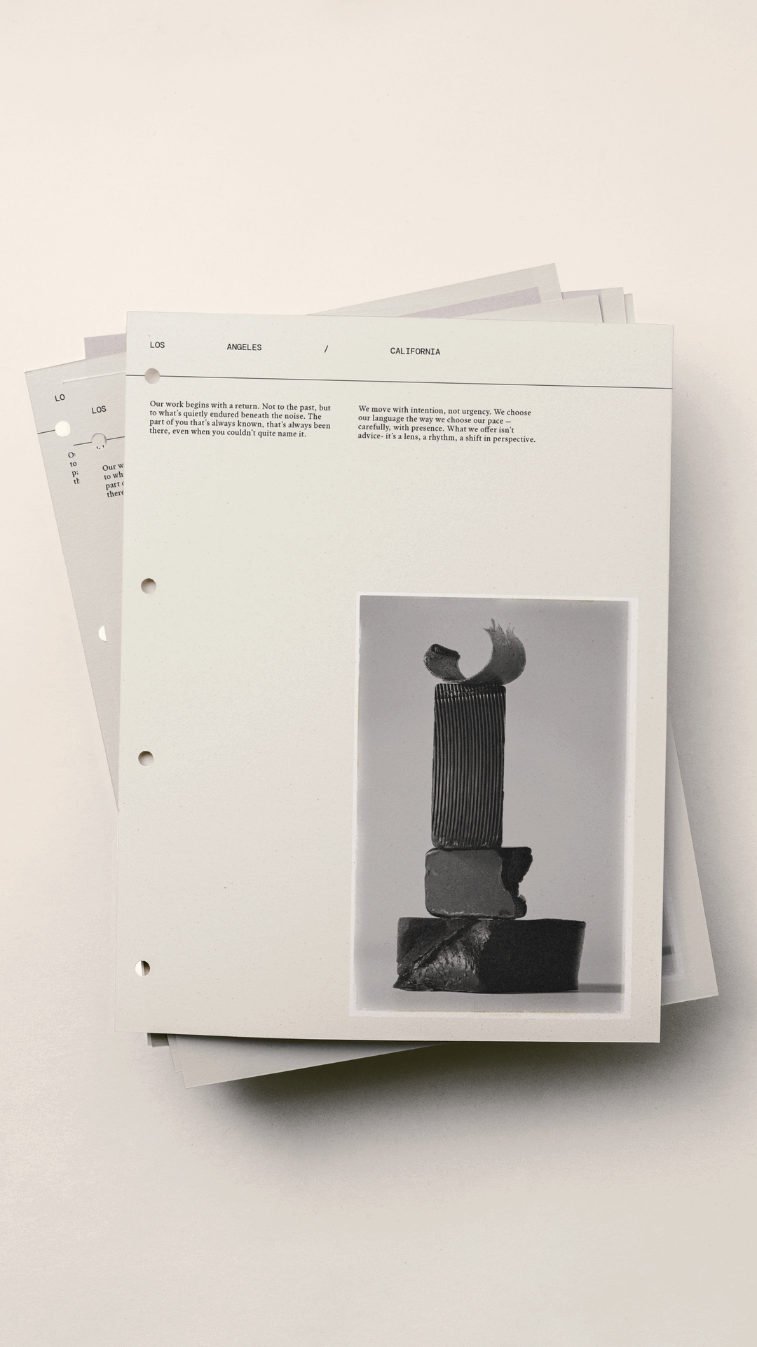

The visual system carried this same language into every medium. Intentional layouts and considered pacing with ample white space replaced ornamental expression, allowing message and imagery to hold equal weight. Headlines were treated like moments of breath; body copy flowed with quiet precision. The brand’s tone was anchored in neutrality — a space where reflection, education, and emotion could coexist without noise.

The newsletter was then reimagined as a digital continuation of this ethos. Designed to accompany each new podcast episode, it became an intentional ritual of communication — uncluttered, elegant, and sensory. Subtle textures softened the screen, photography was curated with restraint, and typographic hierarchy guided the reader gently rather than demanding attention. Every detail was chosen to evoke stillness, presence, and a sense of grounded refinement.


Through this re-design, Know Thyself found visual alignment with its deeper purpose. The brand now speaks with composure — timeless yet contemporary, clean yet alive. It carries the warmth of natural materials within the precision of an editorial system. A reflection of what the project embodies at its core: the beauty of awareness made visible through design.