FRACTAL FOREST
Fractal Forest
SOLUTIONS PROVIDED:
Brand Strategy, Visual Identity, Packaging, Print Assets
Living formulas for living bodies.
Fractal Forest is an Earth-driven wellness company developing ingredient-focused remedies at the intersection of ancient herbalism and modern formulation. Their products are rooted in clinical integrity but carry a quiet spiritual underpinning — plant intelligence, mineral memory, and the geometry of nature expressed through form.
The original brand held strong values but lacked the aesthetic clarity required to reach a more discerning, design-literate audience. The goal was to evolve Fractal Forest from a mystical wellness brand into a premium, science-aligned apothecary capable of sitting on shelves next to high-end adaptogen and skincare lines. The repositioning centered on elevating trust, refining visual restraint, and building an identity system that feels future-focused while still grounded in the Earth.
We positioned Fractal Forest as a modern botanical laboratory — not mystical, not clinical, but a refined balance of the two. The brand language, layout, and materials all reinforce a sense of precision: clean systems, intelligent hierarchy, and no decorative excess. The design invites curiosity rather than explaining everything outright. Nothing is loud, everything is intentional.
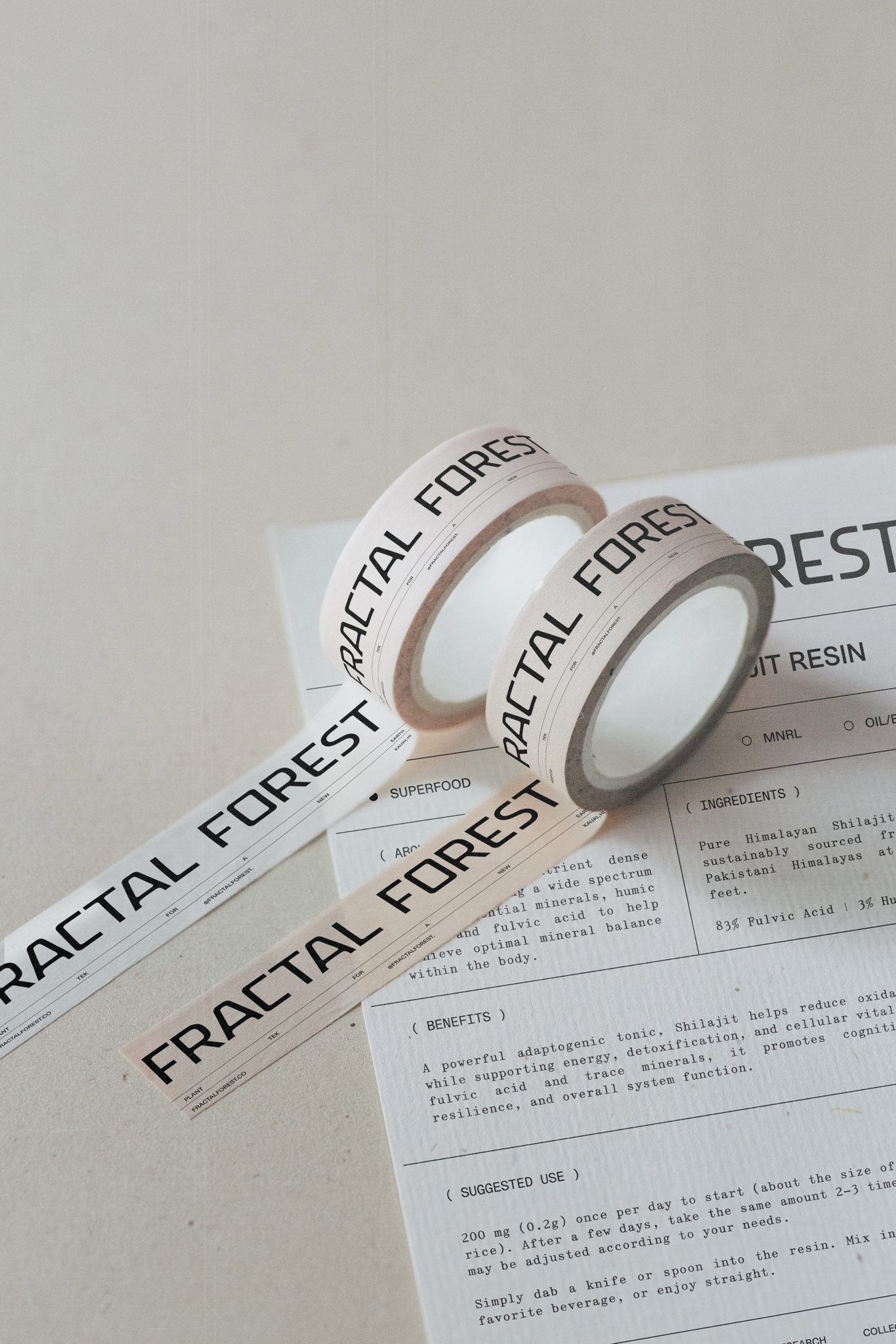
The wordmark, a custom typeface, was crafted to embody the brand’s duality: organic origins rendered through a structural, almost architectural lens. Each character has been optically refined — angular cuts balanced with curved terminals, subtle rhythm across stroke width, and spacing designed for both print packaging and micro-scale embossing. The final mark feels modern, controlled, and distinctly ownable.
The core palette centers on a muted sage green — chosen for its dual reference to plant medicine and grounded calm. It is soft enough to feel natural, but desaturated enough to sit in a modern, elevated retail environment. The supporting neutrals (stone, bone, graphite) create a lab-like clarity, allowing the green to act as a quiet signal across the full product line.
The typographic system is built on a three-tier structure that balances authority, clarity, and warmth. The primary display type carries a strong geometric presence with subtle humanist curves, giving headlines a sense of modern precision without feeling sterile. The secondary style is a condensed, utilitarian sans used for product identifiers and supporting data — technical, concise, and engineered for hierarchy. The body type introduces softer proportions and looser spacing, making longer text feel readable and grounded while still maintaining the brand’s minimalist rhythm.
Together, the three styles create a visual language that feels both structured and alive — scientific in form, but never cold in tone.
The packaging was built to feel less like a supplement box and more like a field specimen — a record of something studied, distilled, and preserved. Every panel serves a purpose: the brand mark holds the top edge with calm authority, the labeled color block identifies the formula at a glance, and the side column reads almost like lab notation, documenting ratios, preparation method, and dosage. Nothing is ornamental. The quiet texture of the stock, the muted green tonal system, and the sober typographic grid work together to communicate trust without theatrics. Each SKU shifts hue within the same spectrum, creating a collection that feels cohesive, archival, and intentionally restrained. It’s packaging that doesn’t shout for attention — it earns it through clarity, structure, and a sense of studied care.
The rebrand gave Fractal Forest the visual clarity and structural sophistication needed to move into a higher market tier — a brand that can sit comfortably in premium retail, speak to a design-literate audience, and scale without losing its soul. The identity now reflects the integrity of the formulas: intelligent, grounded, and built to last.


