
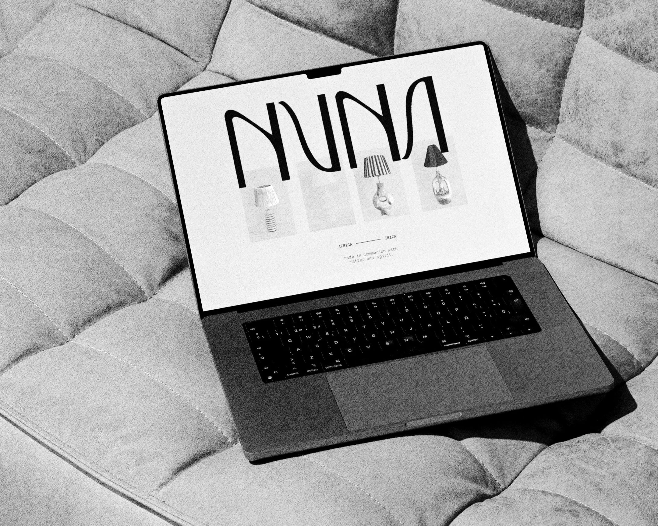
NUNA SANTUARIO
Nuna Santuario
SOLUTIONS PROVIDED:
Strategy, Identity, Print + Digital Assets
A study of presence and reverence.
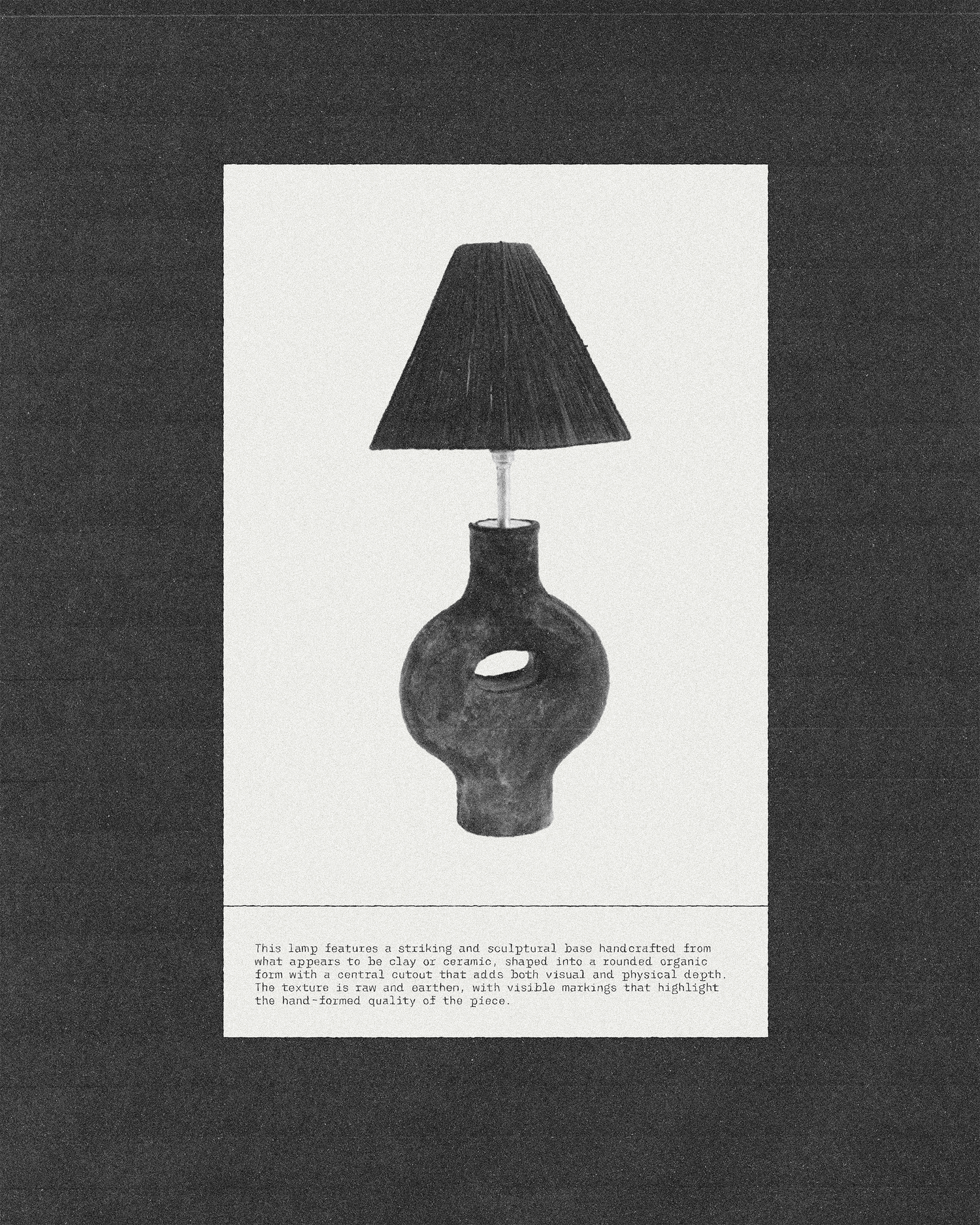
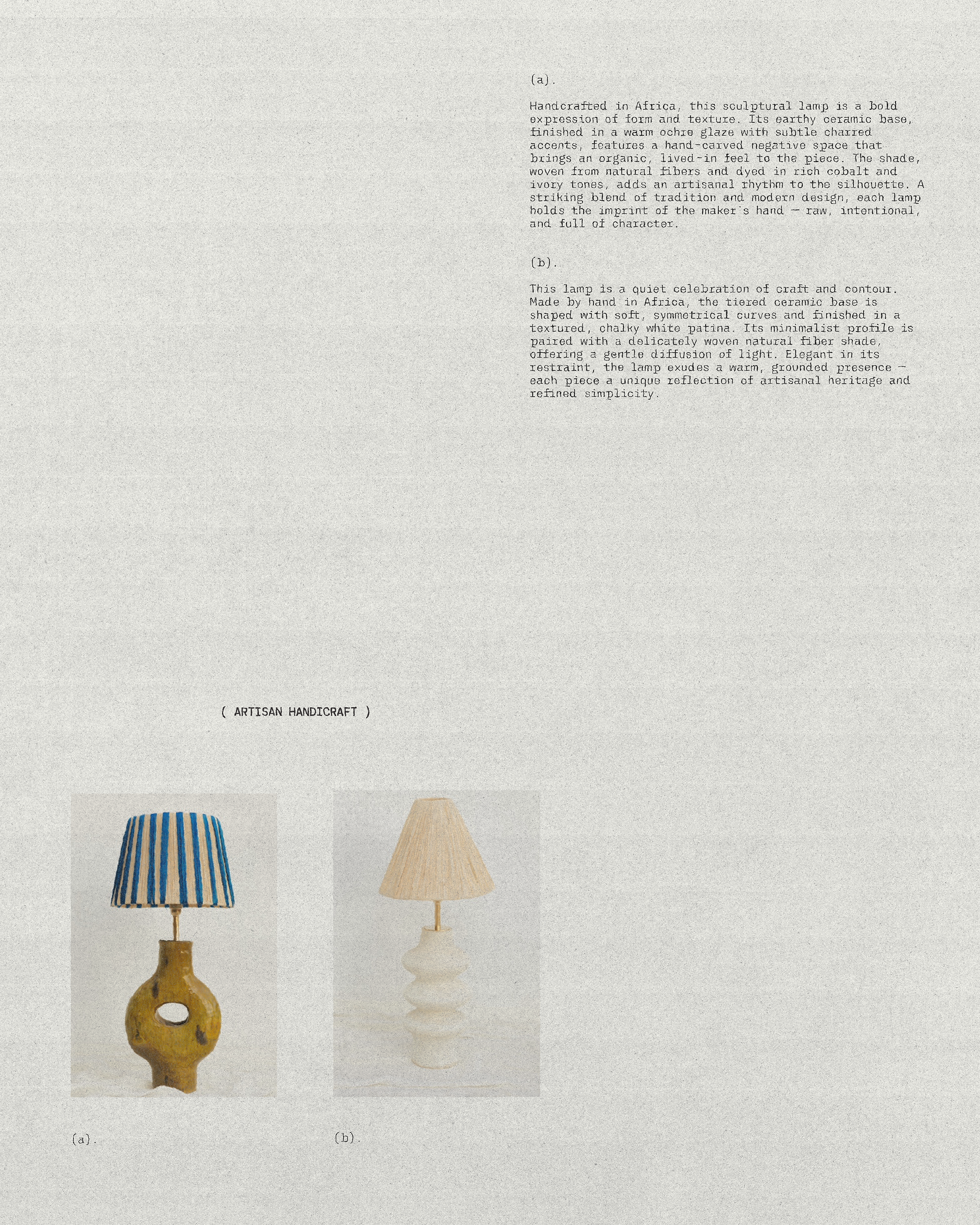
Nuna Santuario is a brand offering sculptural, handcrafted lamps made in Africa — each piece shaped by hand, each form a quiet expression of material and soul. Drawing from natural textures and artisanal tradition, the lamps hold the weight of story and spirit. The creative direction called for a visual identity that honored this singular craftsmanship while offering a contemporary, elevated frame — a balance of restraint and richness, texture and clarity.
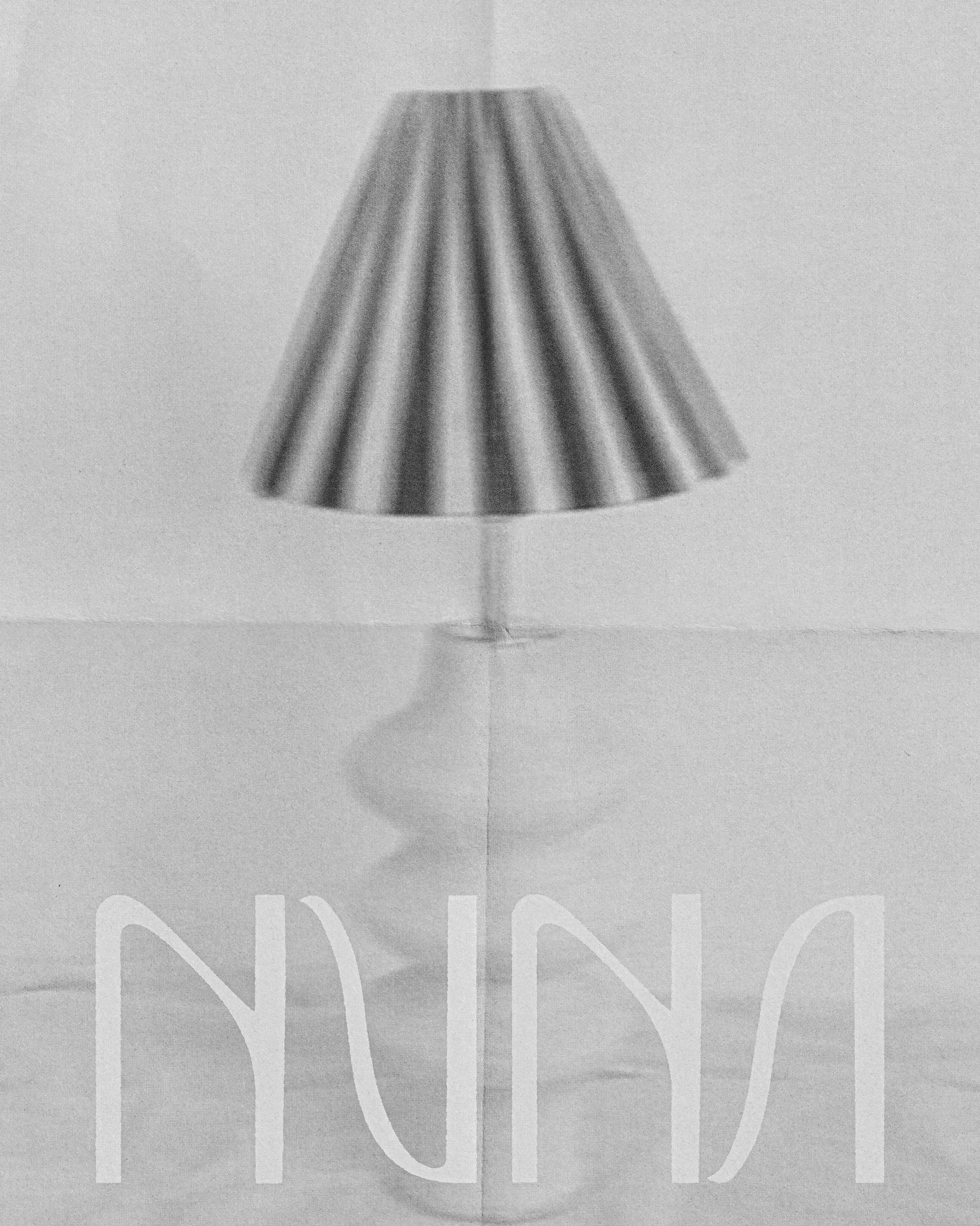
At the core of the identity is a custom wordmark inspired by village finger-paint calligraphy and the expressive curves of Art Nouveau. The letterforms feel both intuitive and refined — a fusion of ancestral gesture and modern elegance. Each stroke was shaped to reflect the rhythm of hand-formed clay, offering a subtle nod to the tactile nature of the lamps themselves.
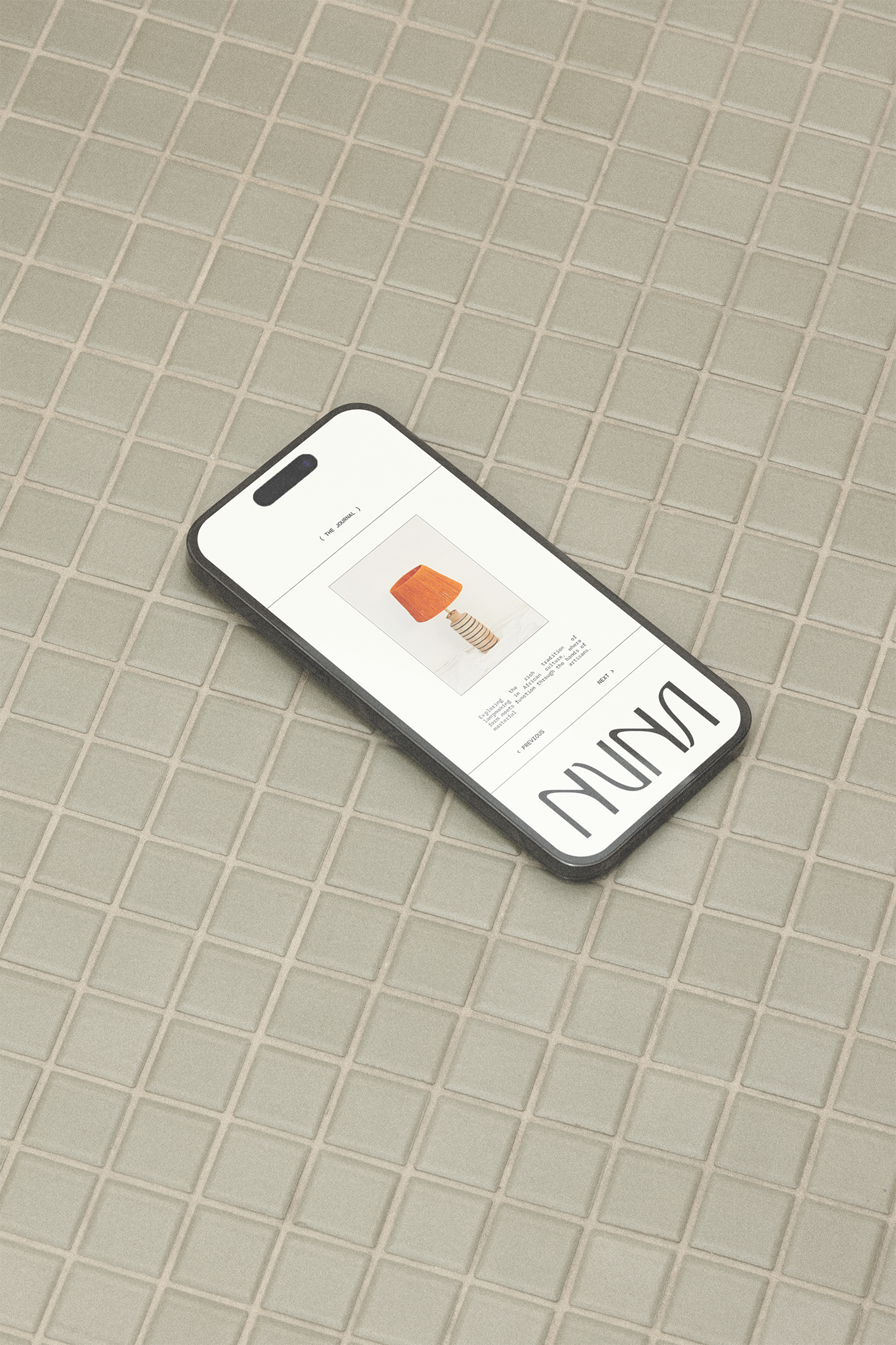
Typography and composition were carefully considered to create a brand experience that is both refined and expressive. The packaging follows the same philosophy, with subtle textures and finishes that enhance the sensory experience, making each interaction with the brand feel intentional and immersive.
The result is a brand identity that feels both fresh and timeless — a visual system that holds space for the object, while elevating it into a new kind of luxury. One rooted in the earth, shaped by hand, and made to be felt.
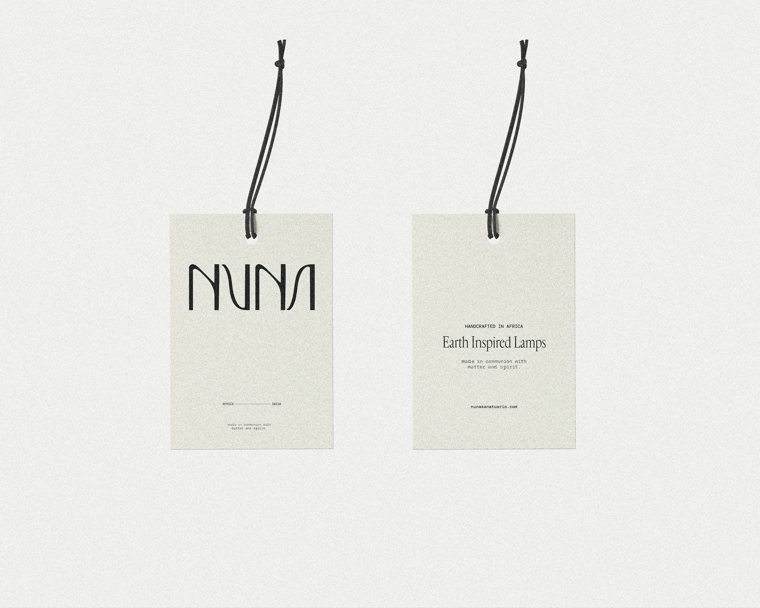
As part of the scope, we developed a complete identity suite and designed product tags that echo the same ethos — clean, grounded, and reverent to the form itself. Each tag serves as a quiet vessel for the story, offering just enough information without crowding the piece.
The visual system extends beyond identity into experience — from tactile packaging to printed collateral textured like handmade paper. Each detail is meant to be felt, not just seen. The mark itself holds space, drawn with restraint so that the negative form speaks as clearly as the positive — a reflection of how light defines shadow, and how presence emerges through absence.

The design language emerged from the tension between raw and refined — echoing the lamps themselves. A grounded palette of mineral neutrals and sun-warmed tones evokes clay, stone, and smoke, while the typography brings quiet sophistication through measured proportion and generous spacing. Every element was chosen to mirror the tactile nature of the work — subtle irregularities, soft edges, and the beauty of imperfection rendered with care.
Through this refined system, Nuna Santuario now speaks in its truest tone: grounded, graceful, and deeply human. The identity frames each lamp as a vessel of story and spirit — a modern relic born from the land and the hands that shape it. What remains is a brand that invites pause, reflection, and quiet awe.