
ETHEREAL YOGA STUDIO
Ethereal Yoga Studio
SOLUTIONS PROVIDED:
Strategy, Identity, Digital Assets
A typographic study of fluidity and form.
Tucked into the quiet hills of Topanga Canyon, Ethereal Yoga Studio is more than a place to move — it’s a sanctuary for stillness, community, and embodied presence. The studio came to us seeking stronger alignment. Its existing visual identity lacked the resonance and refinement to reflect the spirit of the space. The task was to translate the atmosphere — serene, intentional, quietly powerful — into a brand system that felt lived-in and alive.
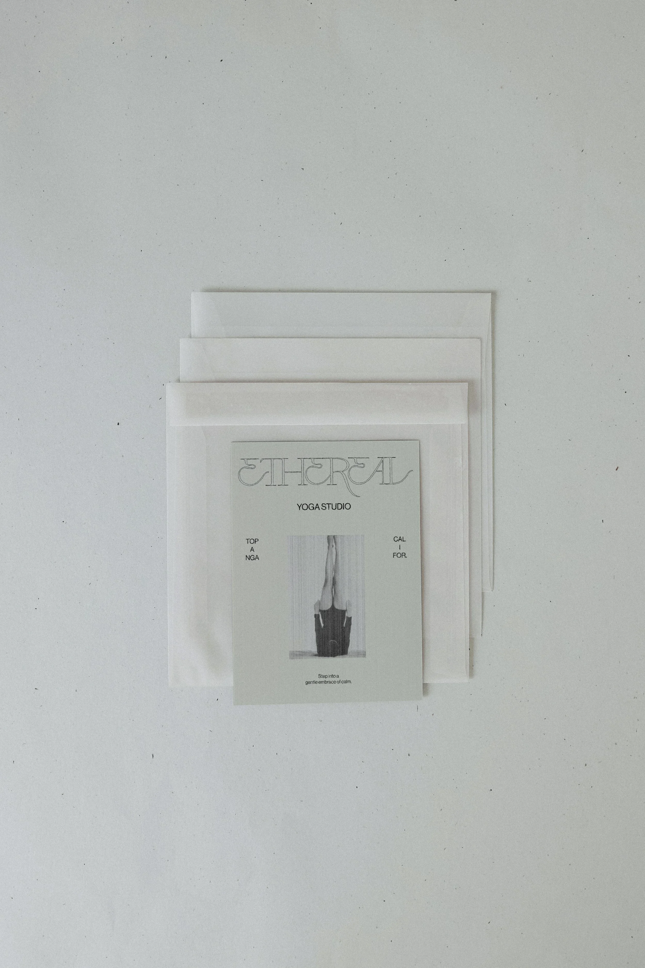
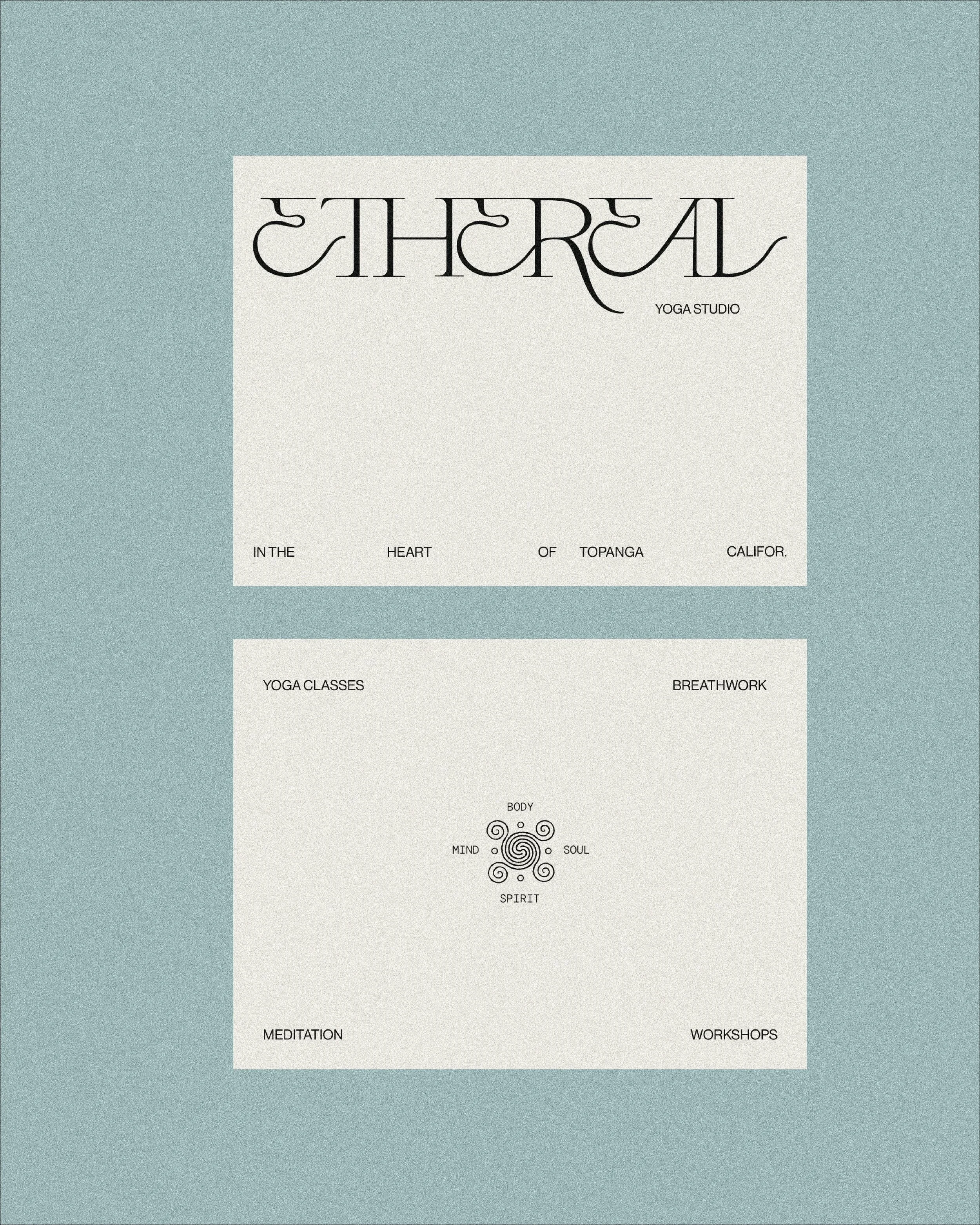
The bespoke wordmark is a typographic study in movement, elegance, and connection. Each letterform was designed to feel both fluid and refined, reflecting a balance of structure and flow. Details like the soft loop of the “E” and the extended finish of the “L” bring a sense of motion and continuity. The result is a wordmark that captures the core of the brand — calm, intentional, and quietly distinctive.
The Ethereal submark intertwines movement and stillness into a single form. Each letter flows with sculptural grace—elongated serifs and organic curves weaving together in quiet rhythm. The composition feels both airy and rooted, like breath meeting structure. Its asymmetry invites the eye to wander, mirroring the studio’s philosophy of balance between body and spirit.
The wordmark’s vintage serif foundation is softened by fluid ligatures, while a subtle monospaced accent grounds the design in clarity. Together, they embody the studio’s essence—where discipline and surrender, form and feeling, coexist in harmonious alignment.
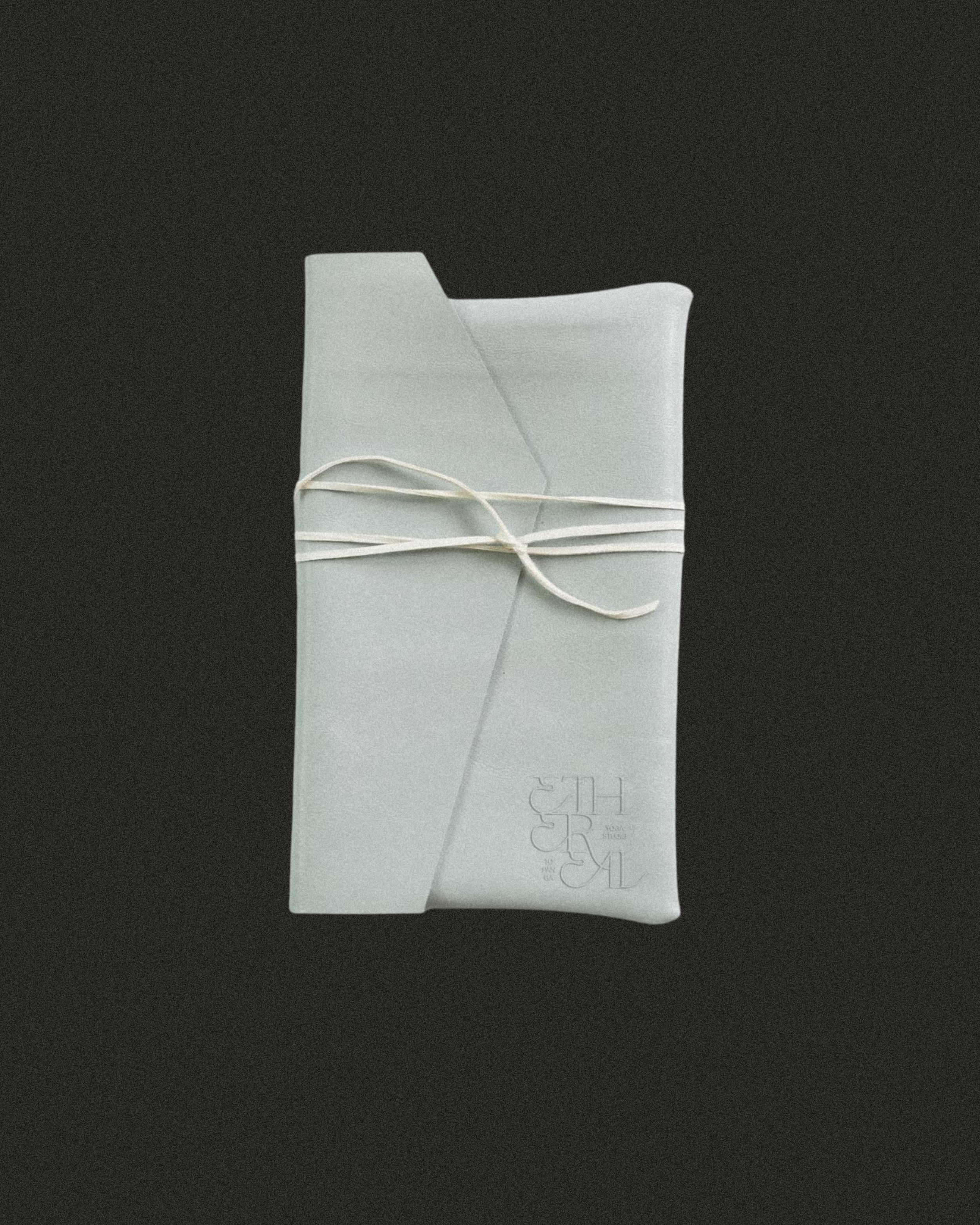
A palette of muted blues and soft neutrals evokes serenity and spaciousness - intentionally chosen to mirror the studio’s gentle, introspective energy and its connection to the natural world.

The refreshed identity restores a sense of calm and continuity to the brand experience. From the gentle flow of type to the grounded color palette, Ethereal now reflects what it offers in practice — a serene space for renewal, connection, and inner stillness.


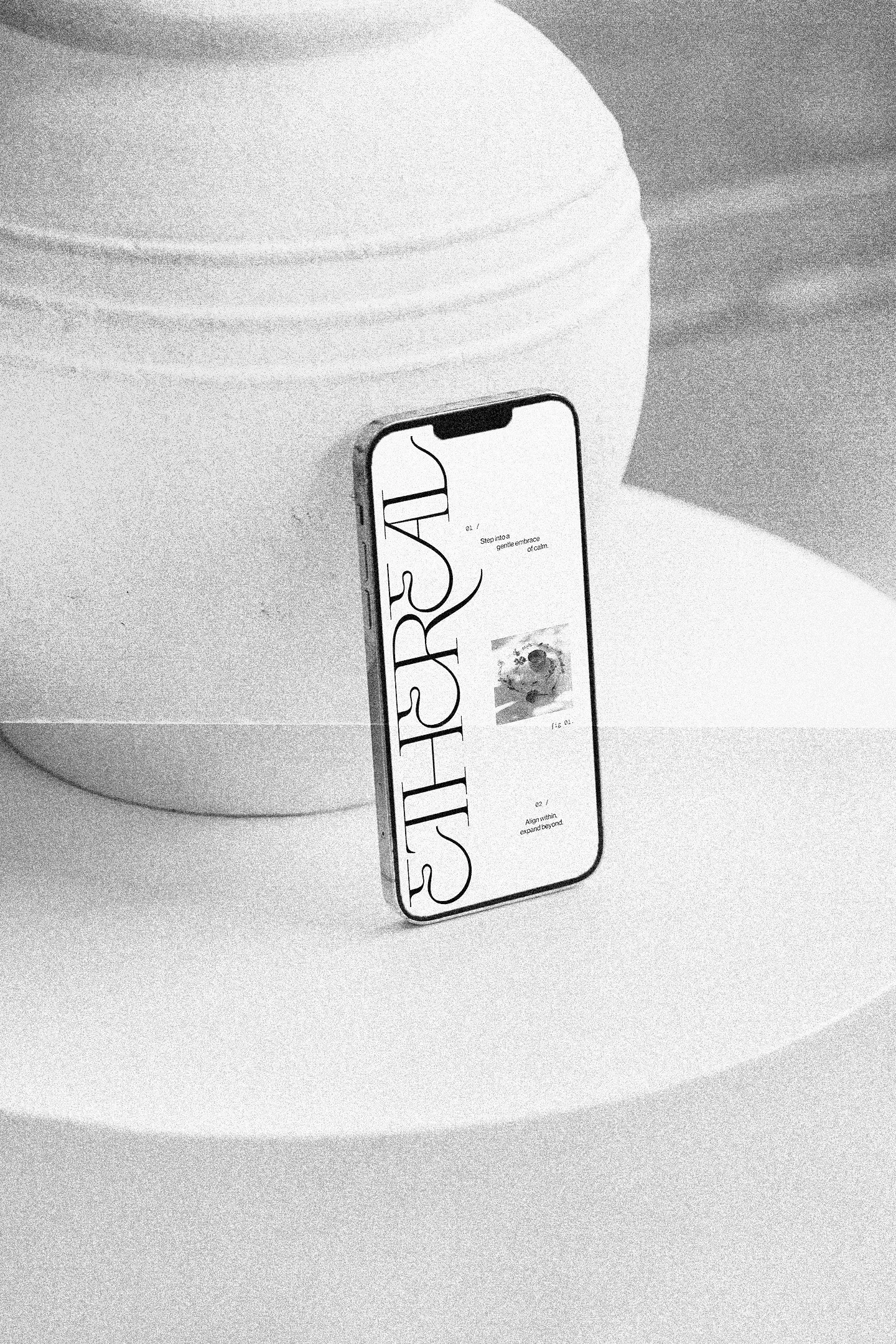
Each design touchpoint was considered through the lens of feeling. The brand extends beyond its logo — into tone, texture, and rhythm — forming an atmosphere that feels lived-in and timeless. Its visual language mirrors the experience within the studio: easeful, intentional, and deeply human.
In essence, the work returns Ethereal to its namesake — light, graceful, and quietly powerful. A brand that no longer speaks loudly, but resonates softly, inviting stillness to be felt before a single word is read.