
PRIMORDIA

Primordia
SOLUTIONS PROVIDED:
Strategy, Identity, Print Assets, Packaging
Botanical intelligence for the body remembered.
Primordia is a skincare line shaped by instinct, memory, and botanical intelligence. Rooted in the textures of the jungle and the quiet power of the body, the brand called for an identity that felt both unearthed and upscale — a visual system that could hold ritual, wildness, and luxury in equal measure. Our task was to distill this essence into a considered design language — one that feels intimate, textural, and enduring.
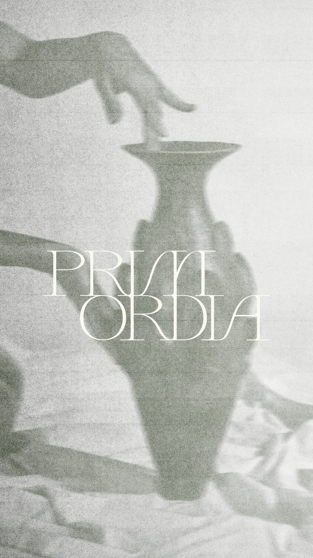
The creative direction draws from aged film, archival photographs, and cultural artifacts — an atmosphere of lived history and quiet ritual. Imagery evokes a sense of timeworn beauty, referencing ancient practices and places where nature still governs. A visual world that embodies the brand’s maxim: of the first nature.
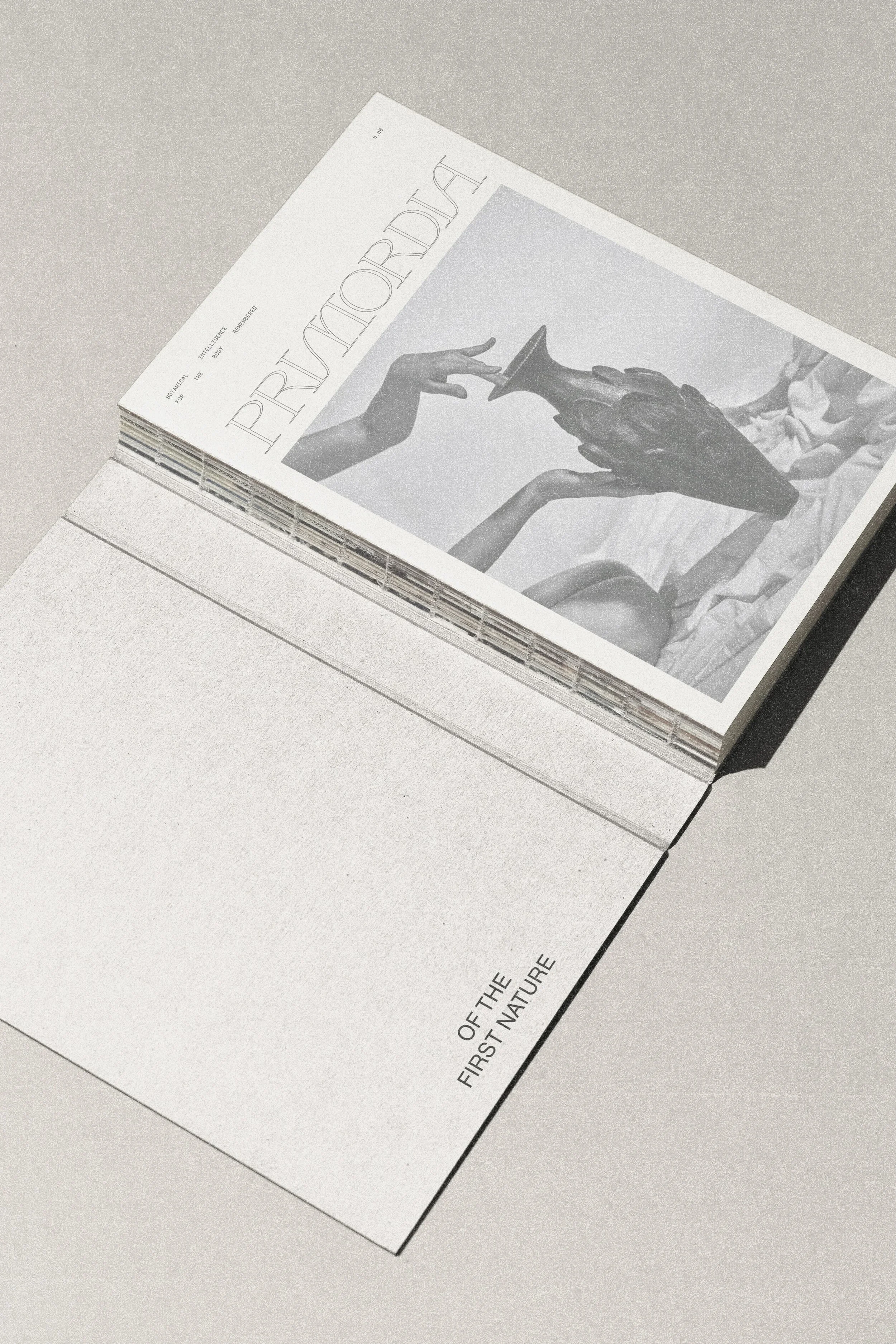
The Primordia logotype is a bespoke wordmark that balances elegance with a sense of unearthed origin. Each letterform is drawn with high contrast — long vertical strokes meet delicate serifs, creating a tension between refinement and wildness. The exaggerated arches and sweeping terminals in characters like R, D, and A introduce a fluid, almost calligraphic rhythm. The secondary mark, intentionally stacked in two lines, the composition feels monumental — a contemporary take that speaks to both body and time.


For NHYT, we designed refined print collateral and stainless steel packaging renders that reflect the brand’s modern purity and quiet sophistication. As part of the scope, we developed a complete identity suite that embodies the same ethos: clean, grounded, and reverent to the form itself. Each element was crafted as a quiet vessel for the brand’s story, offering clarity and restraint in equal measure.

Typography and composition were carefully considered to create a brand experience that is both refined and expressive. The brand palette centers on soft, muted tones that convey a sense of intimacy and restraint. These hues act as a gentle backdrop, allowing the jewelry to remain the focal point while reinforcing a feeling of elegance and calm.
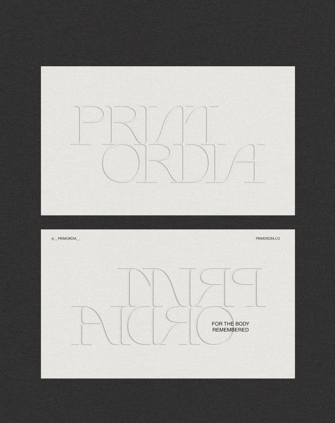
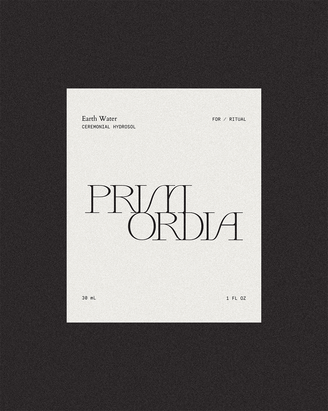
Packaging and collateral were kept intentionally minimal — an exercise in restraint that lets texture lead. Blind embossing became the primary gesture, offering quiet dimensionality and visual intrigue. Every element was designed to communicate through presence — a sense of returning to our original nature. The brand’s ethos made tangible.